Past Work
These project excerpts are a selection of games, animation, web-based interactive media, installations and concept art from over twenty-five years in digital media.
Digital production has evolved with the software and technology, so while this is a visual gallery of sorts it is also a chance to share anecdotes of some of the behind-the-scenes processes.
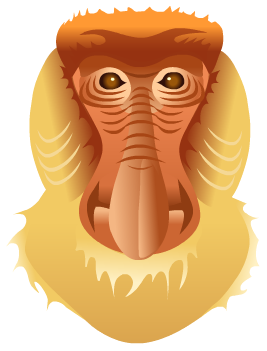
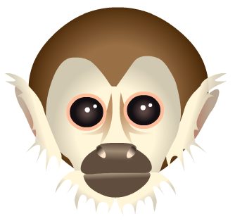
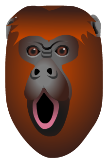
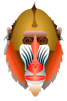
Monkey Face
Design and Illustration
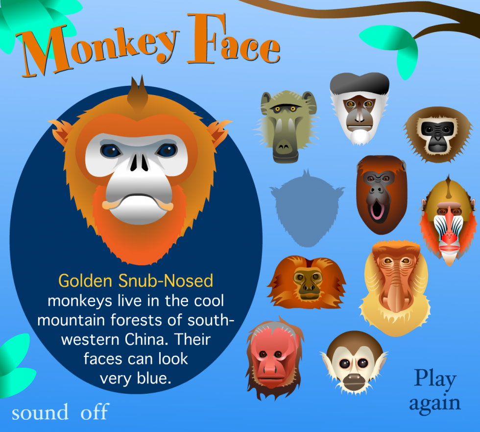
Green Leap is an online community whose mission is “to inform and inspire individuals who share a care and concern for wildlife, nature and the environment in which we live”. The games that I created for the site focused on learning about a particular group of animals or a specific natural ecosystem.
The game “Monkey Face” had two components: a simple game of concentration and a separate section that allowed you to learn a bit of information about each of the monkeys or apes featured in the game. You can see more about the game itself in my project excerpt “Early Interactive Pieces”.
Monkey and ape illustrations shown are: Baboon, Black and White Colobus, Gibbon, Golden Snub-Nosed, Red Howler, Mandrill, Proboscis and Squirrel Monkey.
SOA Graphics
Design and Illustration
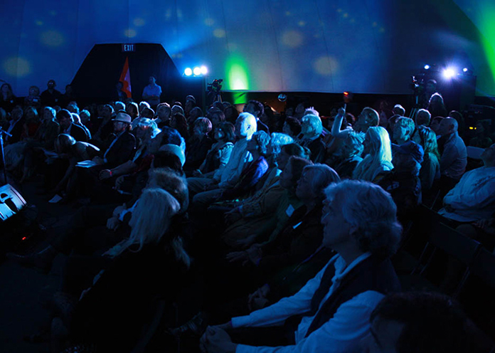
The State of the Arts Symposium, held in 2012 and organized by the Center for Conscious Creativity, was “designed to present a unique perspective on the cutting edge trends in the arts and media and their effect on education, society and culture within the context of immersive media.”
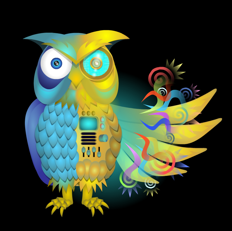
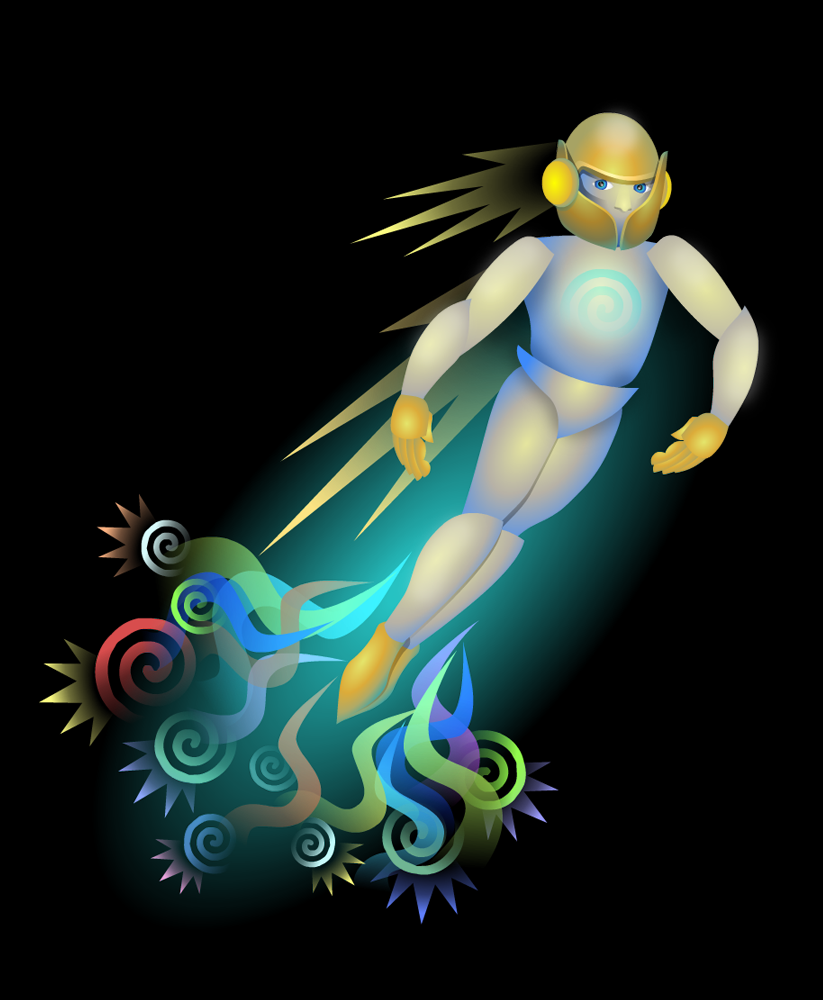
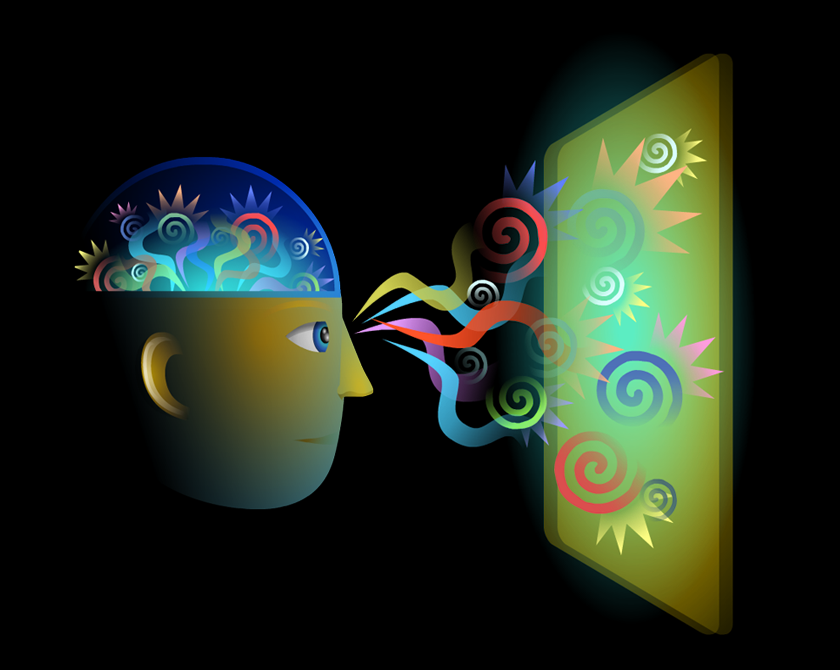
The event was held in the Vortex Dome in Los Angeles, a dome screening and performance venue owned and operated by Vortex Immersion Media in the Los Angeles Center Studios. The graphics I created for projection within the dome introduced the various speaker sessions and reflected the common threads of creativity and mindfulness in the context of immersive media and technology.
Concept Art
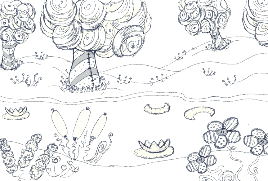
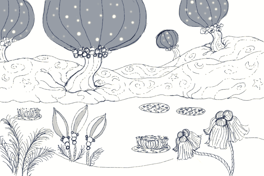
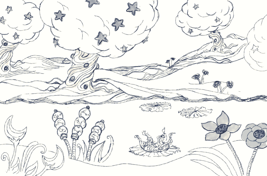
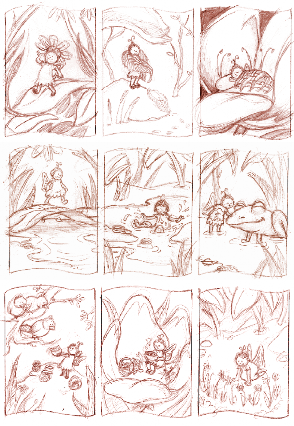
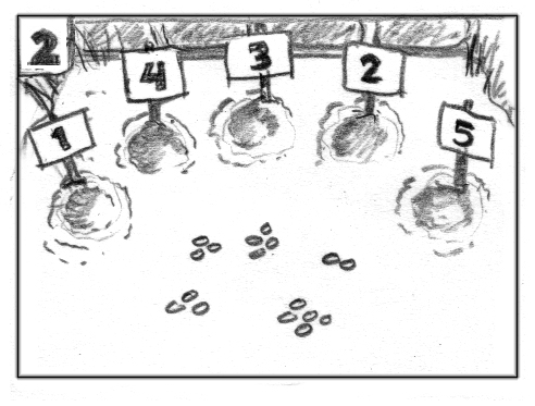
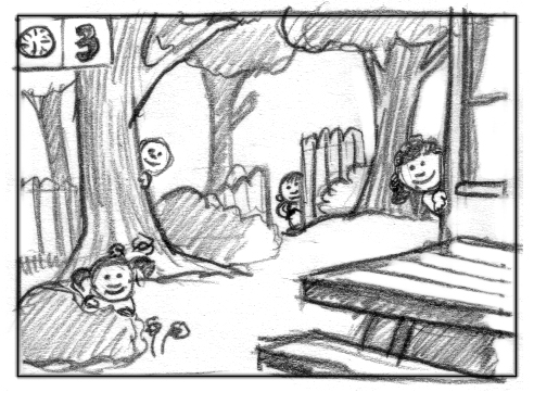
More often than not I produced concept art for the project in which I was involved, rendering ideas for the look and feel of any number of facets of the game or animation. I use ‘concept art’ broadly to entail art and sketches that contributed to the overall visual design, as well as drawings or thumbnails that suggested visual behavior when animation or interaction was involved.
When the teams were small for a given project, I often took on multiple aspects of the overall design—storyboarding, character design and layouts for animation, and design of the user interface.
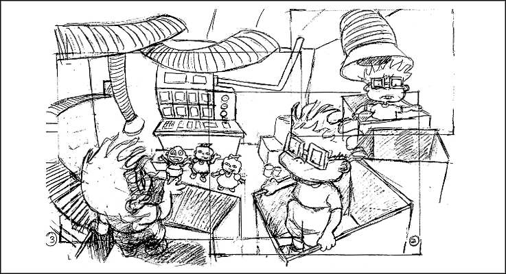
Shown here: environments for a 3D animated lullaby as part of a music DVD, and a simple storybook with three branching storylines for a published game.
Discovery Kids Flipbook
Animation
“Walk and Talk” Films
Art Direction, Storyboards, Design and Animation
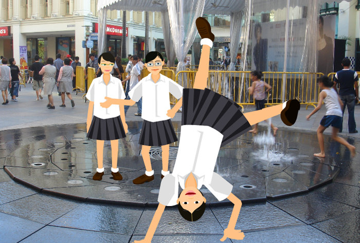
These films were produced as part of the “Walk and Talk” competition sponsored by The British Council of Singapore and The National Library. Students submitted a two-minute audio walking tour of a Singapore location and the ten winning entries were turned into animated shorts. I conducted an initial storyboarding workshop with the students and over several weeks we fleshed out story direction and artwork.
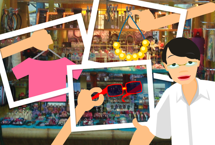
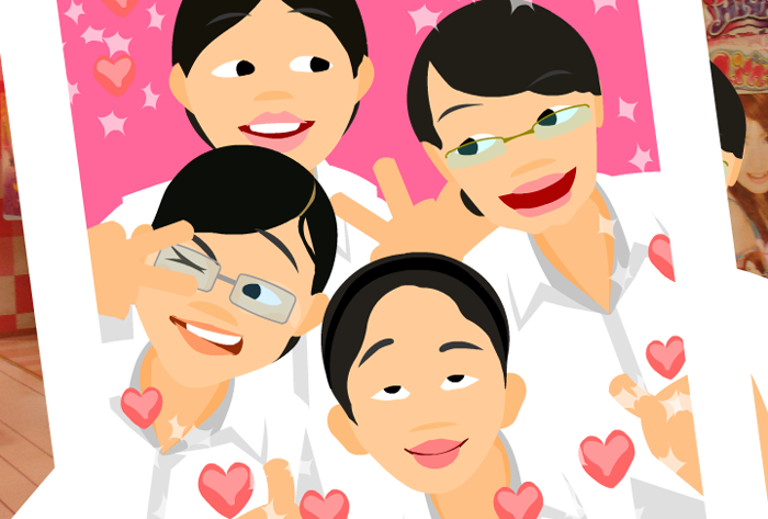
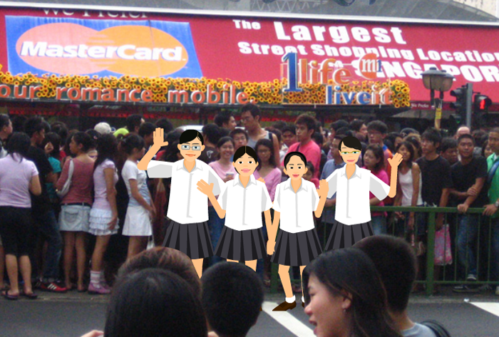
When the art contribution from a team was minimal, I designed the visual story and animated the piece. Two are shown here. Based on a few key concepts that the students shared during our workshop, “Sungei Buloh” played the hustle and bustle of city life against the quiet serene of the nature preserve. In “Bugis Junction”, the students wanted to convey the spirit of their close friendship through photos they took of their favorite places to hang out together. I animated their cartoon likenesses moving from one framed photo location to another.
Character Design and Thumbnails
I had a professor in college who was always pointing out the bits of a drawing that held vitality. With his nose close to the paper he would curl and crimp his fingers over an imaginary pencil, as though channeling the act of that lovely little mark coming into existence.
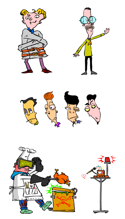
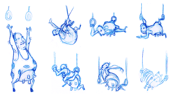
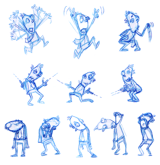
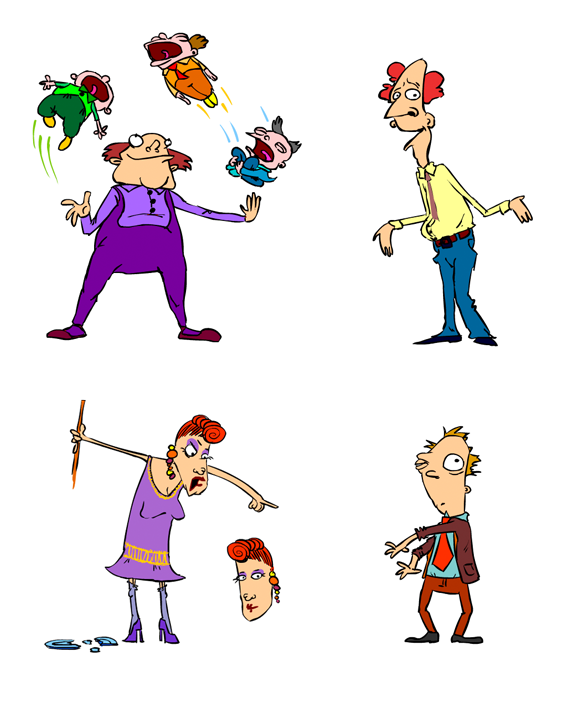
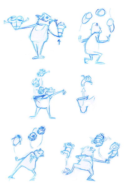
Creating thumbnails has a similar appeal and energy, allowing not just the design of the character to emerge, but the personality as well. The bottom drawings were sketched for an interactive animated web series from Wild Brain Studios about performers with unusual stage acts. Final character designs are included. This a grouping of animation thumbnails that I particularly enjoyed working on, due to the absurdity of the show’s content.
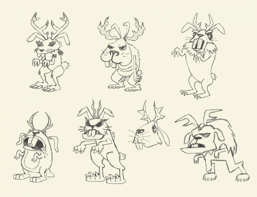
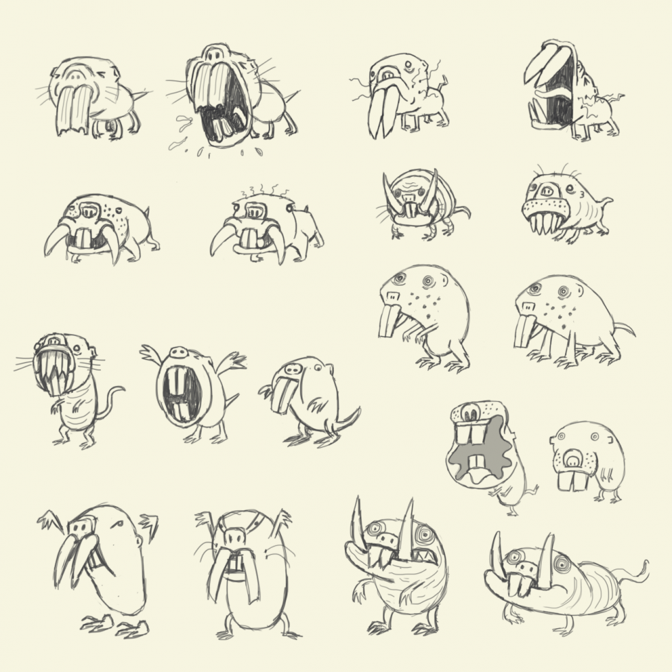
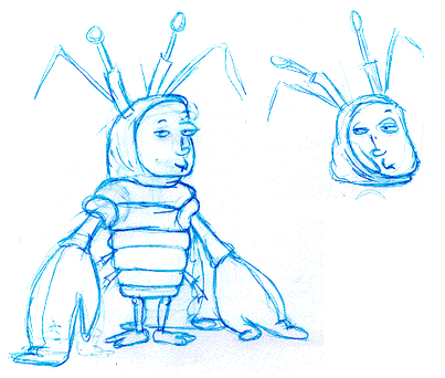
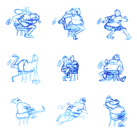
The top three images were design ideas for two monster critters—a naked mole rat and a jackalope— for a Massively Multiplayer Online Game (MMOG) that was canceled mid-production (not an entirely uncommon situation). See the project “2D Game Art – Building Bits and Pieces” for more about translating the character designs into game assets for animation. (I was sorry not to see these critters in action.)
Rugrats
Game Character Animation, Cinematic Animation, Story Design & Storyboards
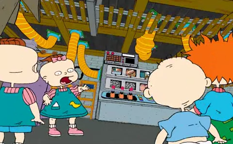
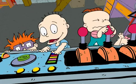
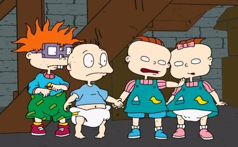
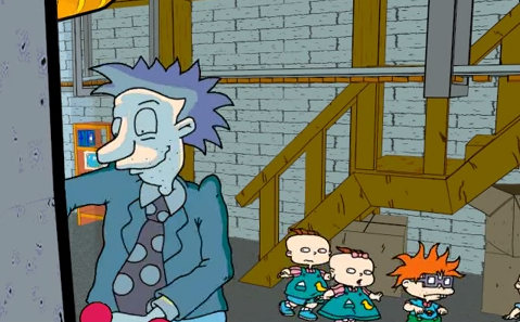
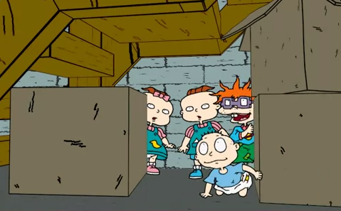
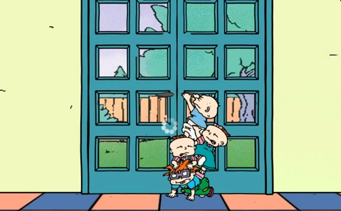
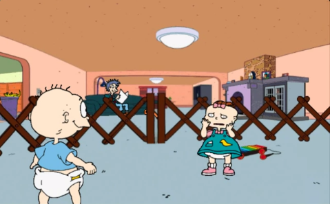
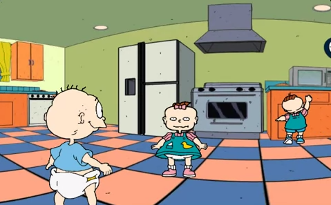
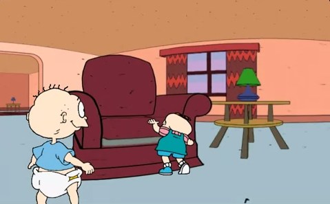
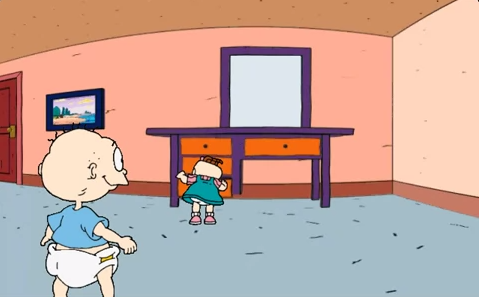
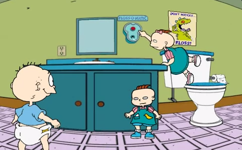
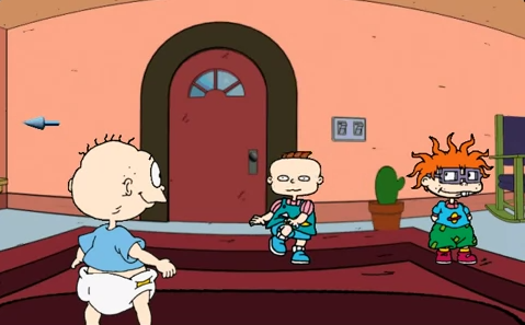
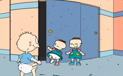
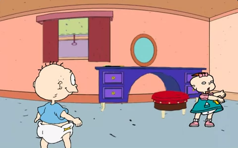
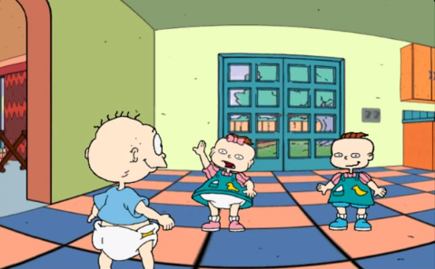
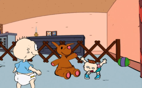
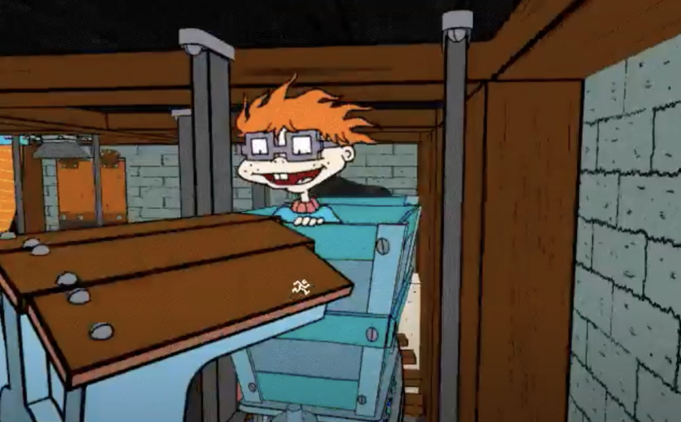
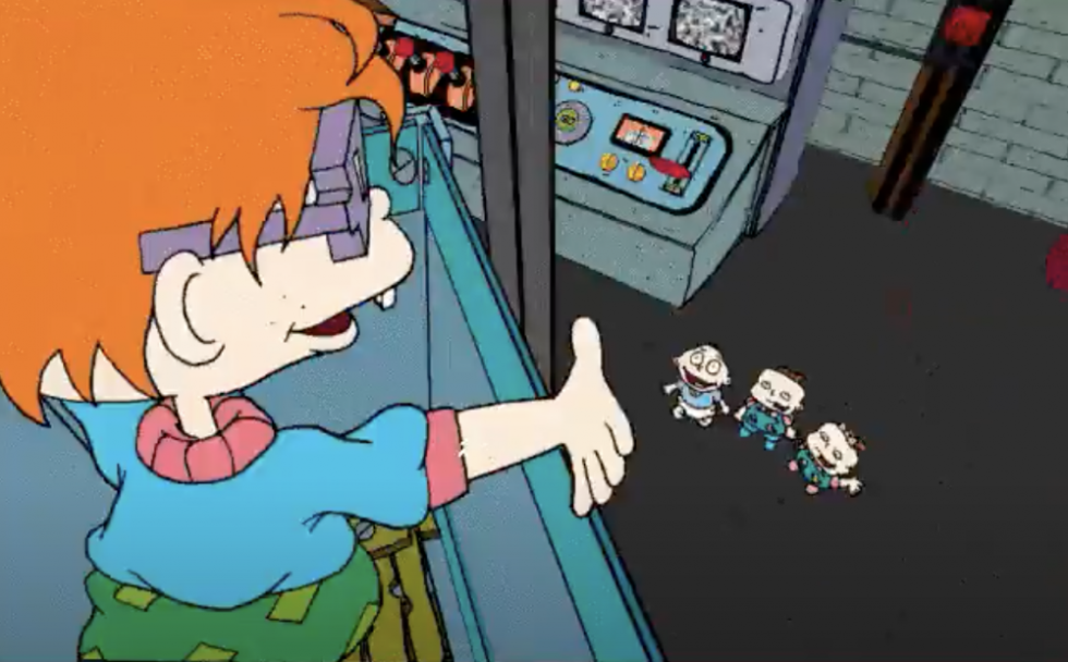
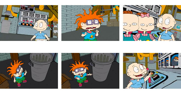
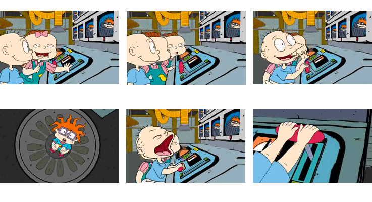
The Rugrats Adventure Game was the first computer game for the popular Nickelodeon’s Rugrats franchise, published on CD-ROM for Mac/Win. The game translated the TV-series world into an interactive environment that put the player eye to eye with the Rugrats. By combining 2D character animation with 3D-rendered sets the game maintained the TV show’s look and style while providing navigable spaces for the player.
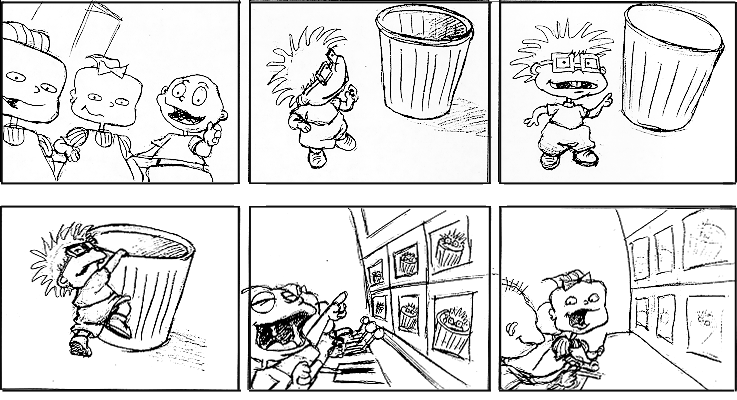
Given the scope of the game, and the sheer amount of animation involved in the cutscenes and playable parts, the developer, Broderbund, enlisted a small army of visual artists and animators. I was involved throughout the production, first as a storyboard artist, then as an animator for a handful of cutscenes, as well as lead animator for Phil and Lil game animation as they look for and collect items in different rooms of the house.
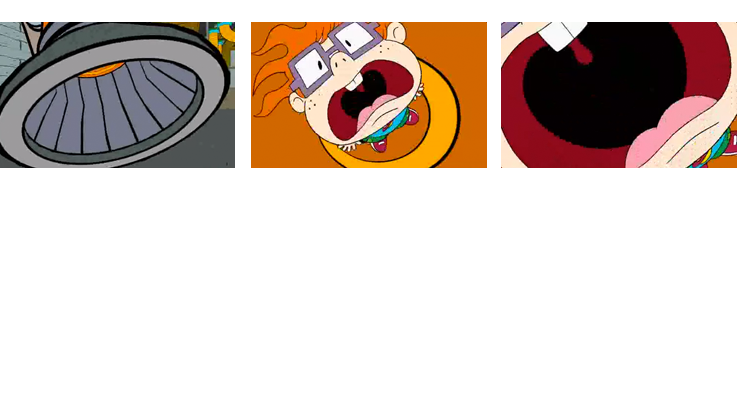
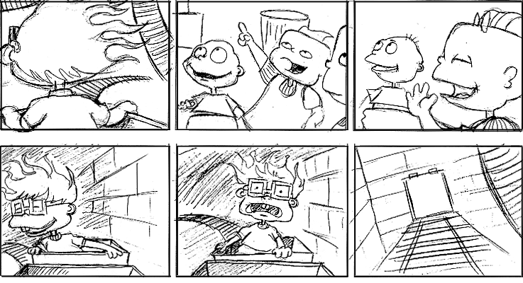
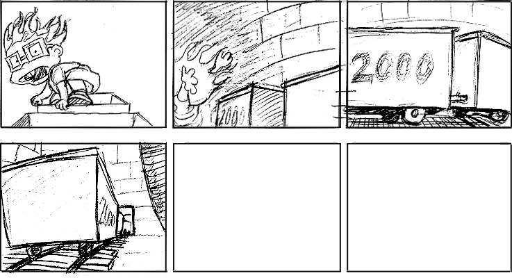
With the production steps at the time, getting the 2D animation to work well within the 3D background was a gratifying process. I was pleased with the animation I did for Chuckie once he is successfully dumped into the train. Having designed the story sequence I was able to sit down with the 3D animators and maneuver where the camera would move to to capture the camera angles as they were storyboarded. I then worked with a stack of sequential printouts of the moving train, on which and into which I drew 2D Chuckie. You can see the sequence here at around 22:00.
Hamtaro
Art Direction, Game Layouts, Cinematic Animation, Game Character Animation, Storyboards & Story Design, Background Art
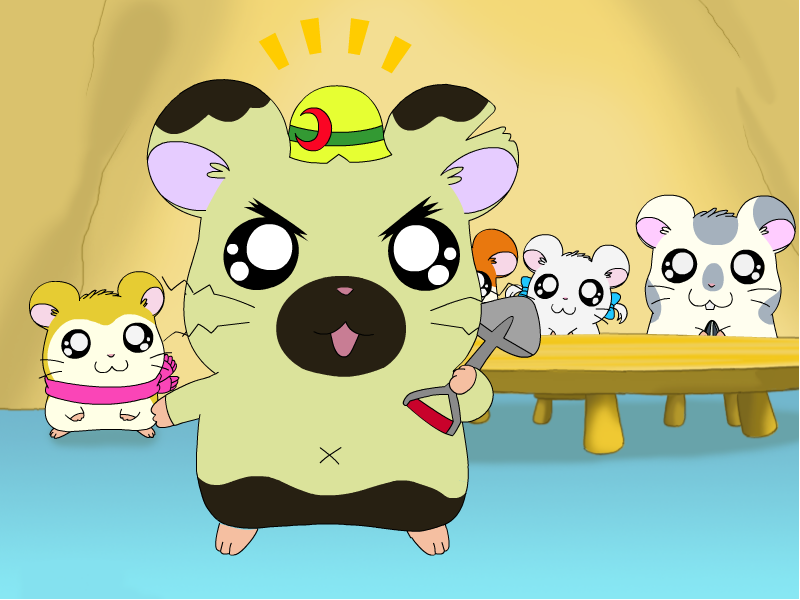
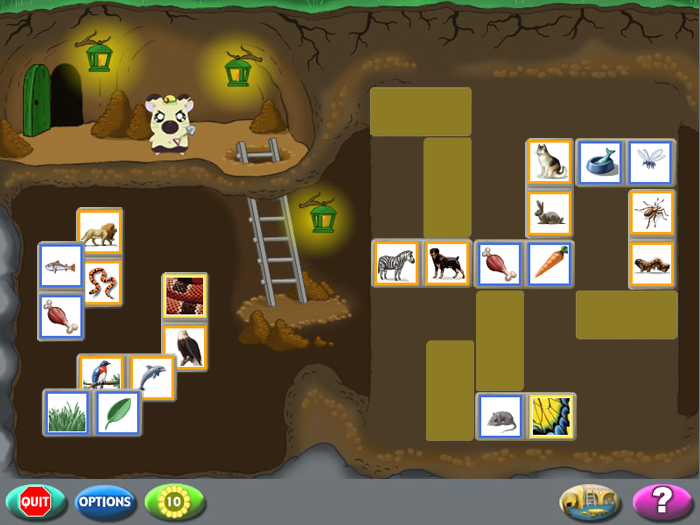
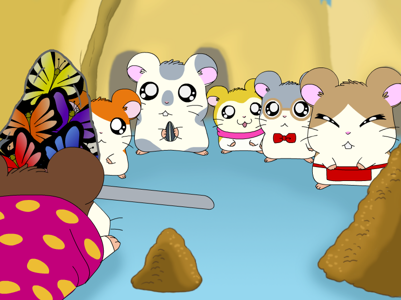
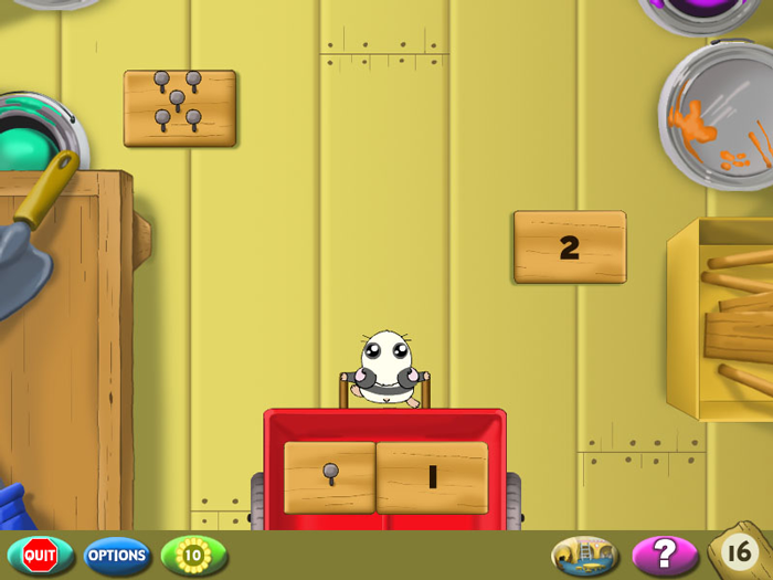
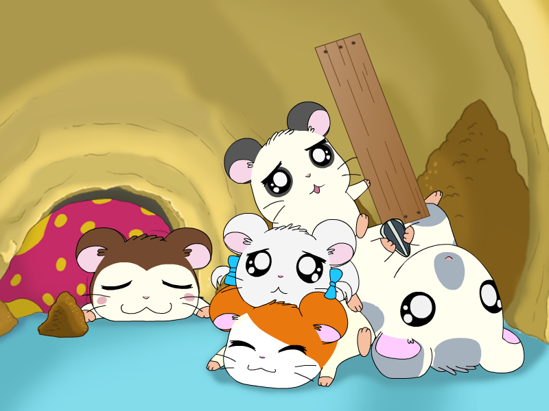
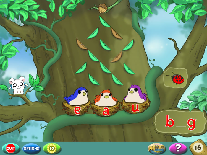
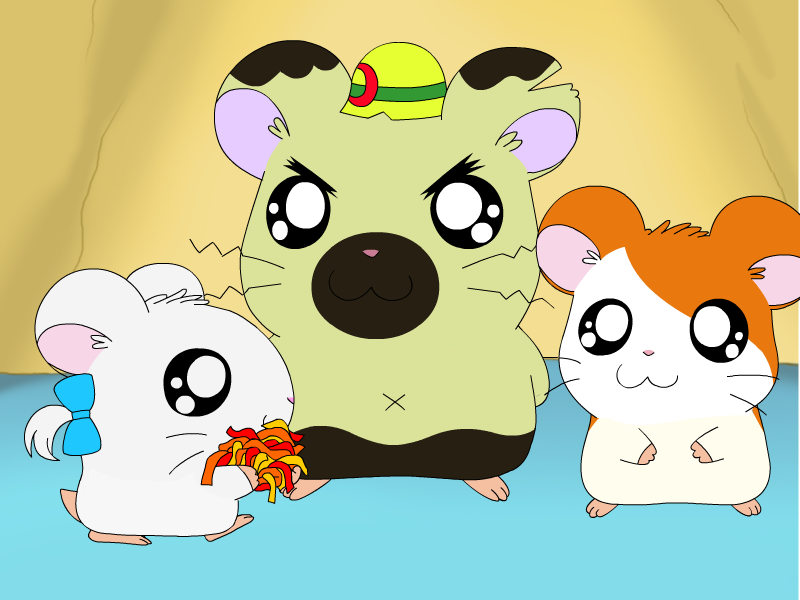
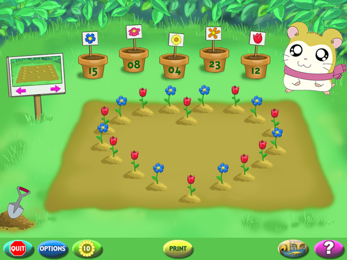
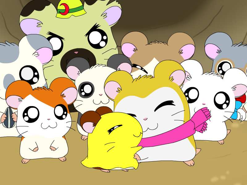
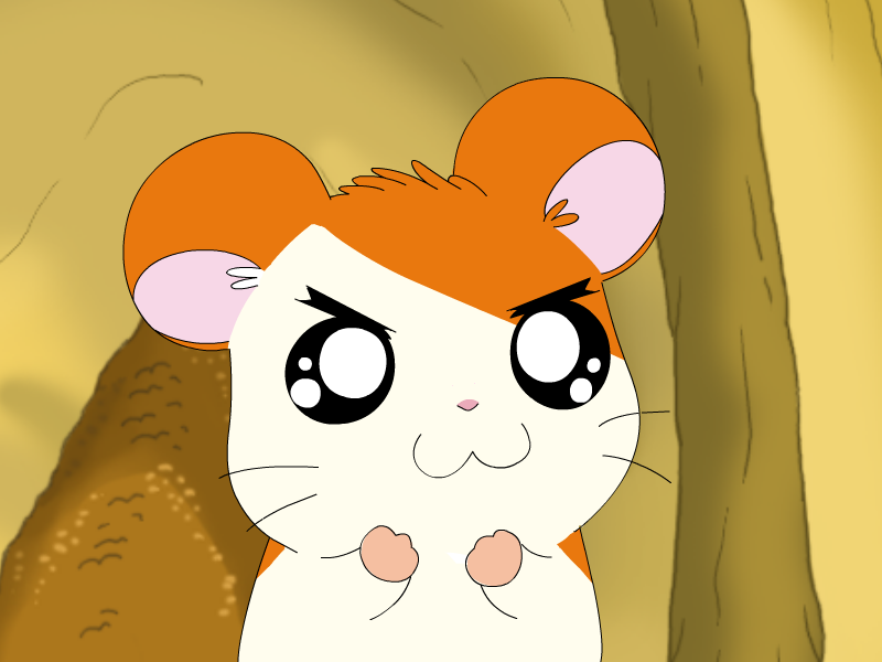
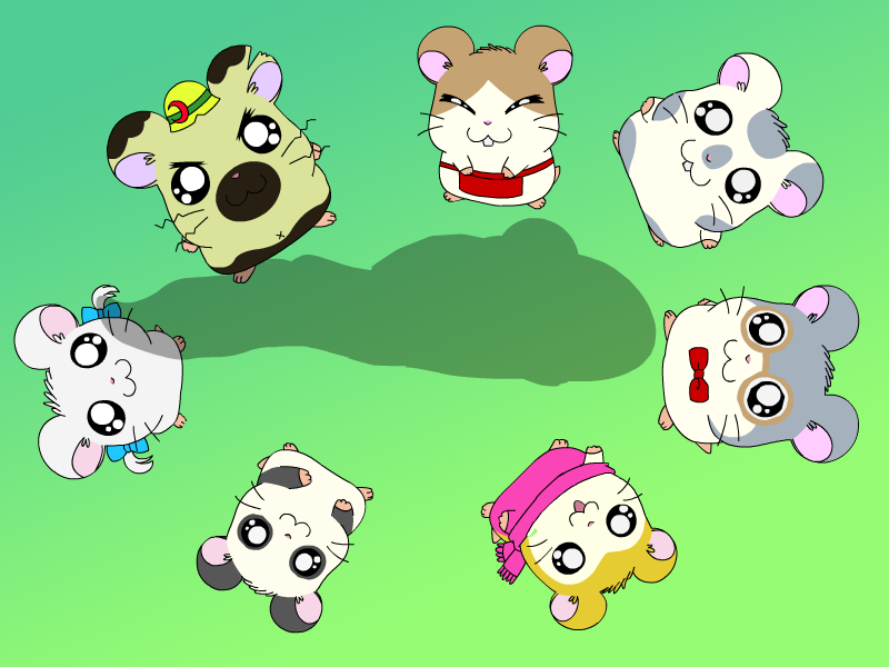
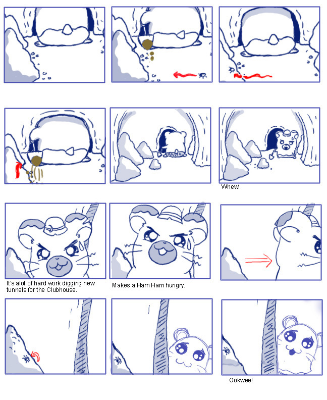
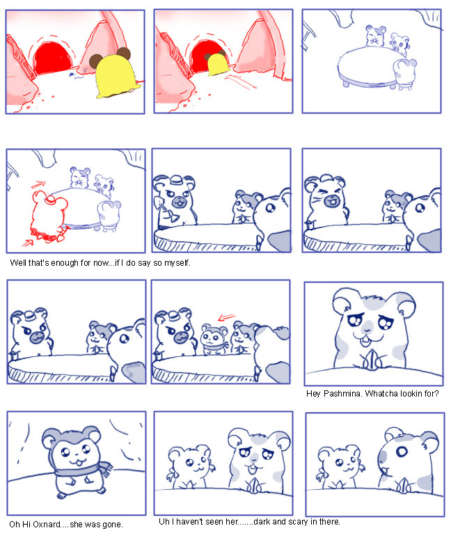
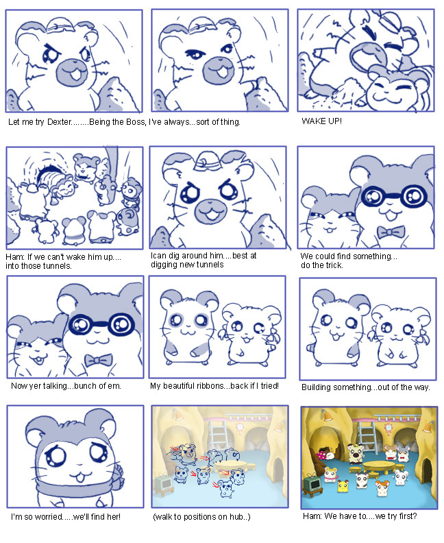
Based on the popular Hamtaro TV series, the Hamtaro: Wake Up Snoozer game was produced and developed by ImaginEngine and Riverdeep/ShoPro as one of the Learning Company’s educational titles targeted at kids ages 4-7. The game’s premise is to help the ham-hams rescue Penelope who has become lost in Boss’s freshly dug tunnels. Kids work through five different activities, each associated with separate characters and covering different educational goals such as math, language or logic, in order to find her.
For this game I created the majority of artwork for the game layouts, backgrounds and animated game assets, as well as storyboards and animation of non-interactive sequences. In order to allow our compact team of programmers and artists to generate the needed assets efficiently, I enlisted a production process that streamlined content creation.
Because of the simple shapes of the characters, and animation style of the show, we were able to work with vector graphics as opposed to hand-drawing and scanning in the art. This allowed animation that reappeared throughout the game to be animated once, and then rendered to bitmap at the relevant size depending on whether it was a cinematic sequence or part of gameplay.
Chutes and Ladders
Storyboards and Animation
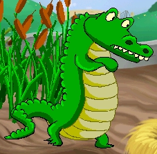
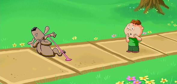
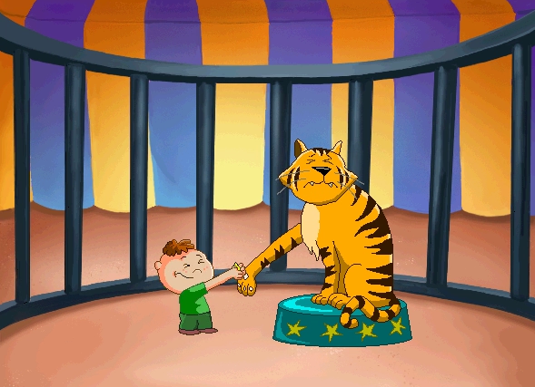
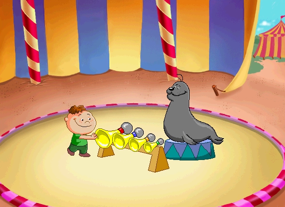
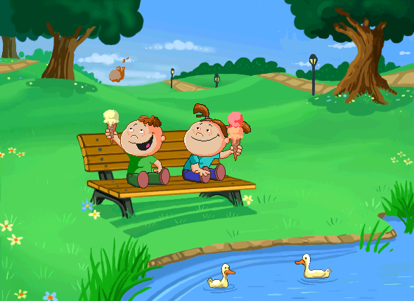
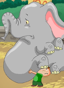
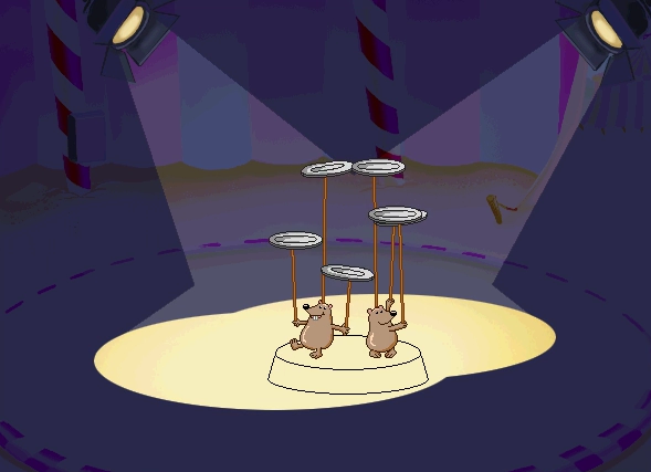
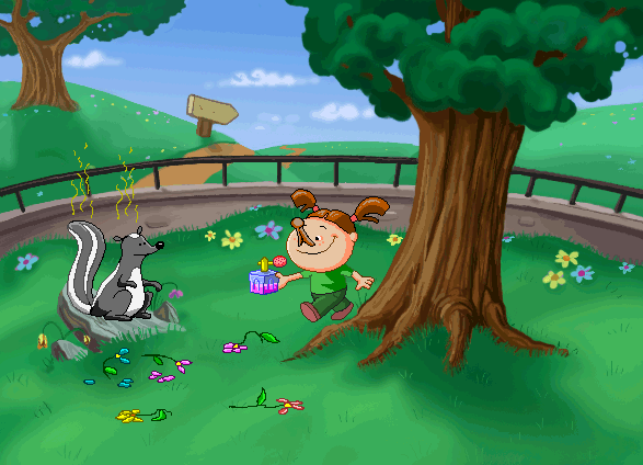
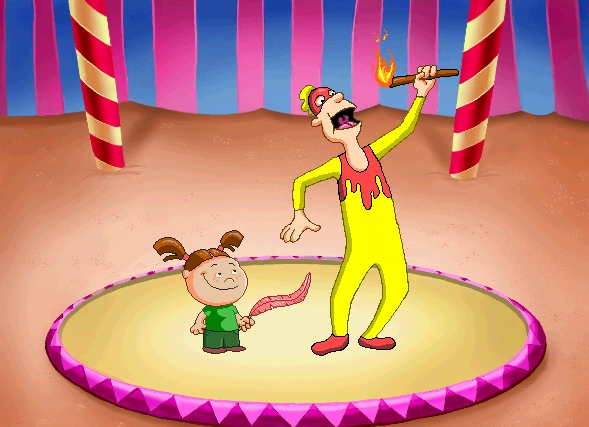
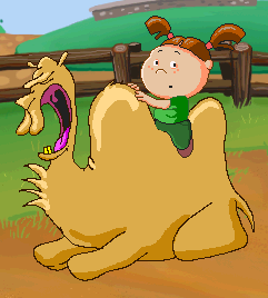
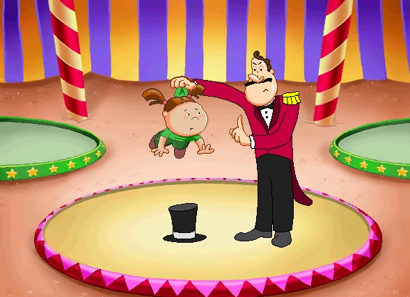
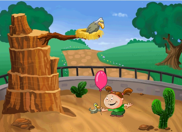
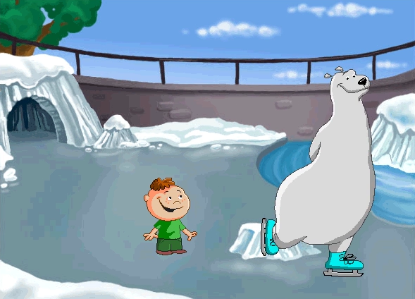
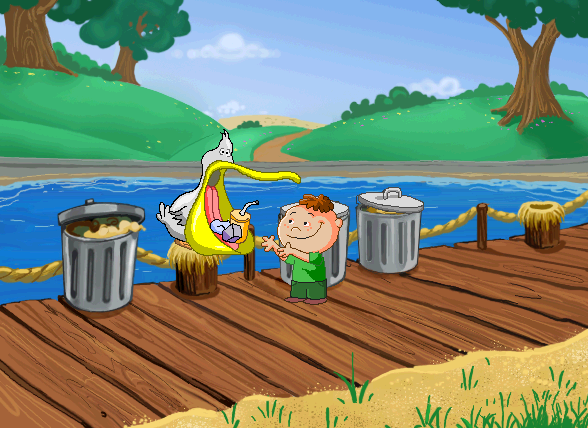
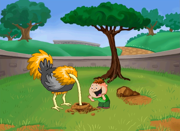
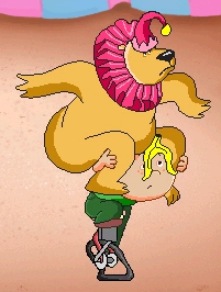
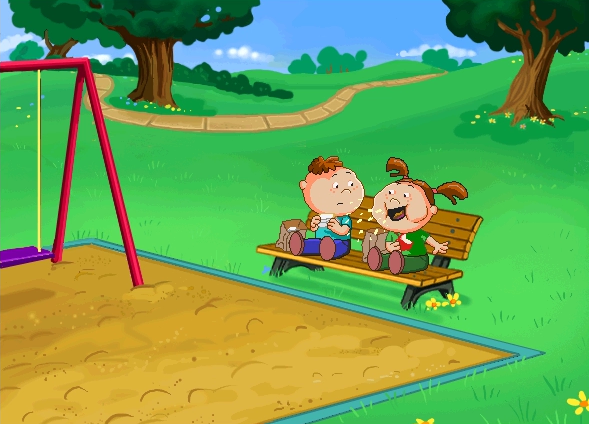
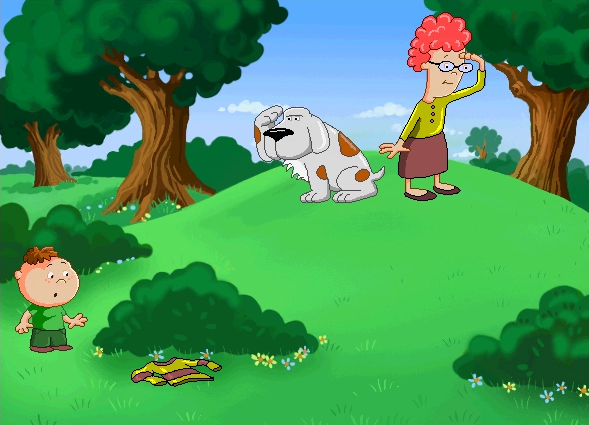
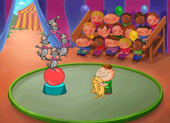
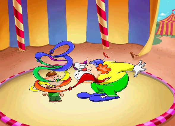
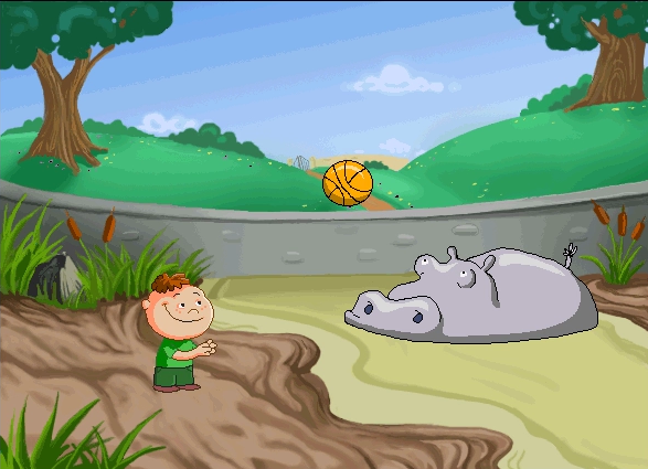
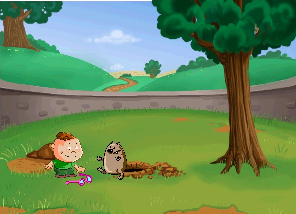
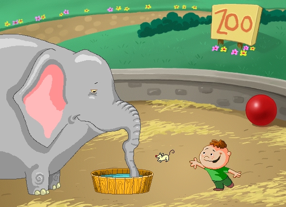
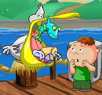
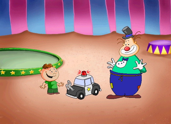
The computer version of Chutes and Ladders for Hasbro Interactive introduced a few new aspects over the traditional board game. One of these involved a series of “Do” and “Don’t” movies that showed each time a player went up a ladder or down a chute. The movies were short lessons in social etiquette and the consequences of nice or naughty behavior towards others.
I created the storyboards for all three of the locations within the game where the vignettes took place—at the Zoo, the Park and the Circus—and worked with the writer and producer on how the positive or negative consequences played out in each scenario (many of them based on that look a parent can give—you know the one).
Unfortunately I no longer have the original storyboards, but the animations survive. The forty plus sequences that I completed were all pixel art animation.
Singapore Art Museum “Be A City Planner”
Creative Direction, Production Design, Game Design and Development
In honor of Singapore’s 40th anniversary as a nation, the Singapore Art Museum created the Blink! exhibition which presented a retrospective of the physical and social changes that took place in its first forty years. “Be A City Planner” was developed as a partnership between the museum and the GameLab at Singapore’s Nanyang Technological University, where I was the lab’s director.
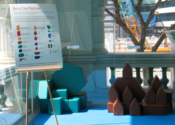
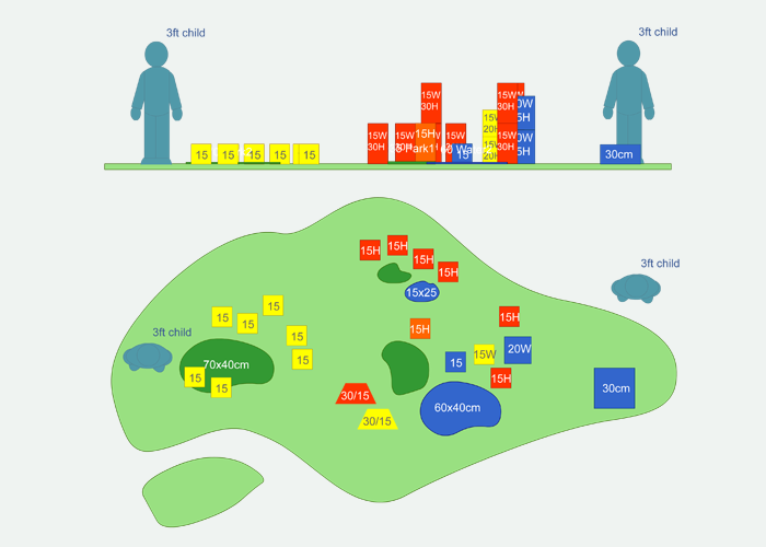
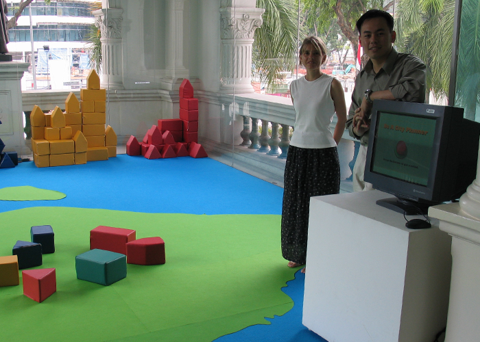
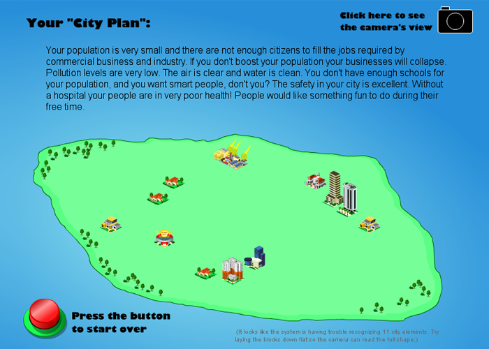
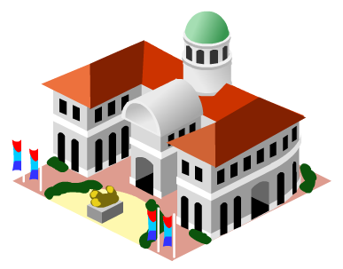
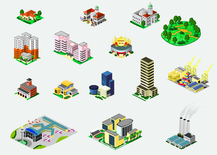
The installation was a hands-on exploration of the challenges facing a rapidly growing nation. On a large Singapore-shaped floor map visitors could place foam blocks of different colors, shapes and sizes. The blocks represented city structures including hospitals, schools, residential buildings and factories, each corresponding to one of the city’s basic needs. A ceiling camera fed the block layout into a nearby computer that ran a simplified urban simulation program. The program took the configuration of blocks and recreated the layout as an onscreen virtual city, complete with images of buildings that resembled actual structures in Singapore. Visitors received feedback as to whether their city configuration achieved desirable living conditions.
The museum worked closely with educators, allowing them to focus on those aspects of city planning that were relevant to their course and age group. Besides serving as director of the project, I designed and programmed the urban simulation program. Wong Chee Kien Gabriyel of NTU’s GameLab wrote the image recognition software.
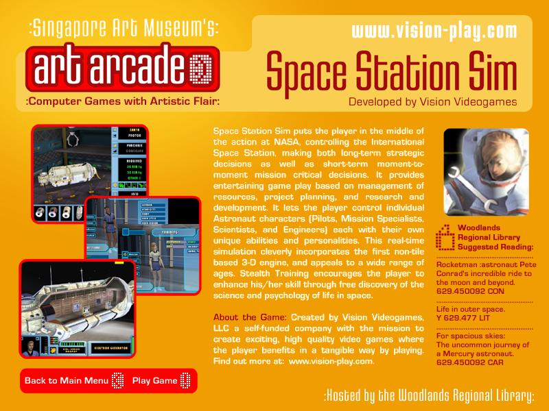
Art Arcade
Creative Direction, Exhibit Curator, Graphic Design
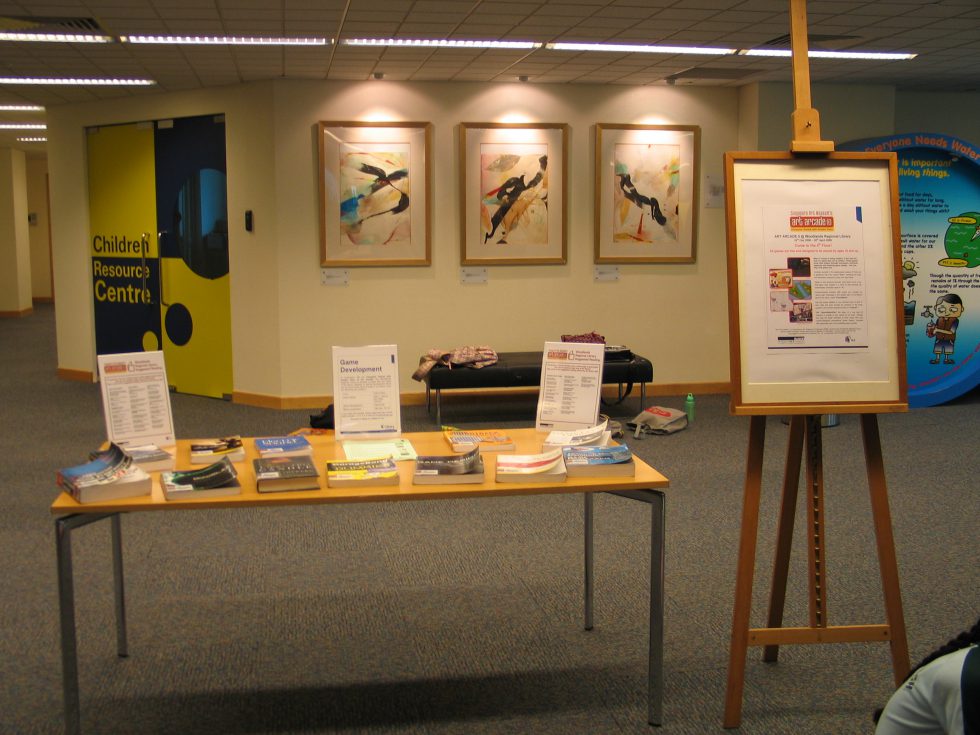
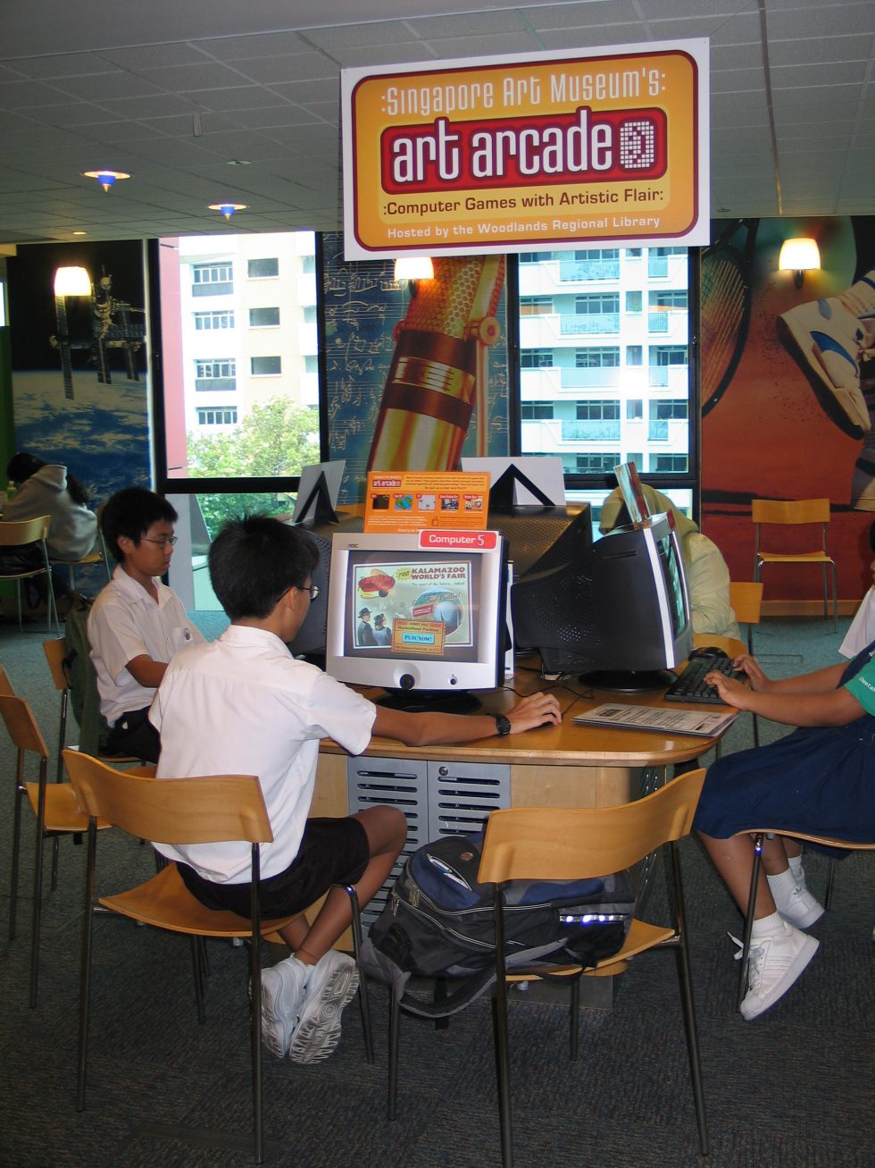
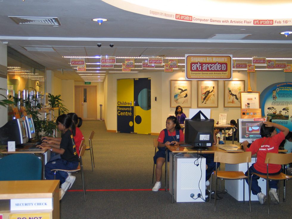
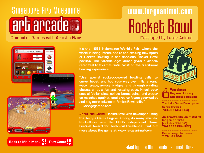
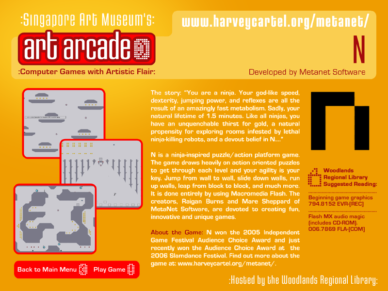
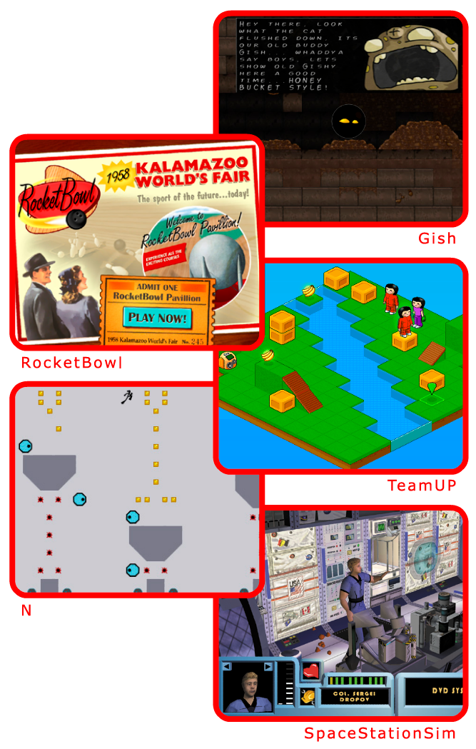
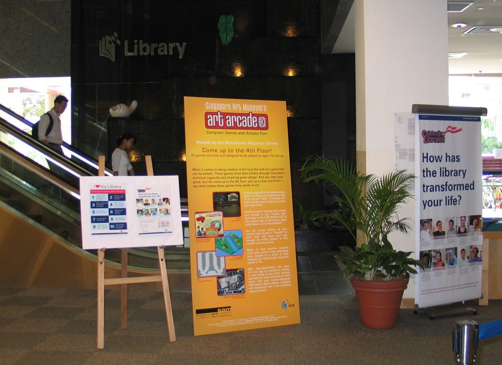
The Art Arcade was a program run by the Singapore Art Museum and hosted by the National Library Board of Singapore. The mission was to build awareness of games situated outside the commercial mainstream. It showcased a handful of independent titles and offered inspiration to budding game designers and artists.
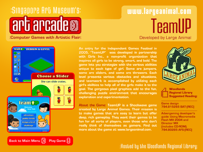
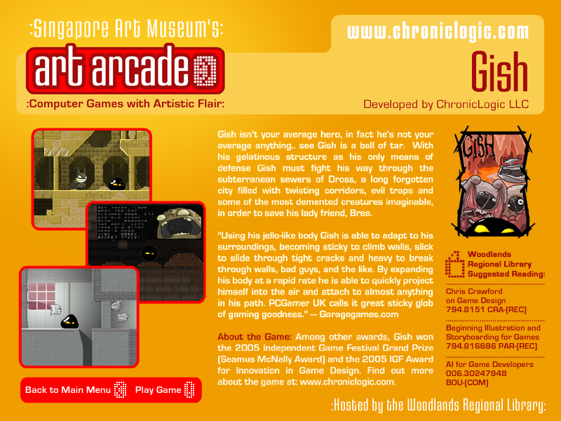
The arcade exhibit was installed for two and half months on the children’s floor of Singapore’s largest regional library. The program included five games: “Gish” by ChronicLogic, “TeamUp” and “Rocket Bowl” both by Large Animal Games, “N” by Metanet Software, and “Space Station Sim” by Vision Videogames.
Along with curating the games showcase, I created the graphics for the library space, and worked with the library to connect aspects of each game with reading material within the library system. I worked with a local software company, Paradise Isles, to develop a game portal that ran on each of the Art Arcade computers, providing information about each title and access to playing them.
Concept Art
More often than not I produced concept art for the project in which I was involved, rendering ideas for the look and feel of any number of facets of the game or animation. I use ‘concept art’ broadly to entail art and sketches that contributed to the overall visual design, as well as drawings or thumbnails that suggested visual behavior when animation or interaction was involved.
When the teams were small for a given project, I often took on multiple aspects of the overall design—storyboarding, character design and layouts for animation, and design of the user interface.
Shown here: environments for a 3D animated lullaby as part of a music DVD, and a simple storybook with three branching storylines for a published game.
Character Design and Thumbnails
I had a professor in college who was always pointing out the bits of a drawing that held vitality. With his nose close to the paper he would curl and crimp his fingers over an imaginary pencil, as though channeling the act of that lovely little mark coming into existence.
Creating thumbnails has a similar appeal and energy, allowing not just the design of the character to emerge, but the personality as well. The bottom drawings were sketched for an interactive animated web series from Wild Brain Studios about performers with unusual stage acts. Final character designs are included. This a grouping of animation thumbnails that I particularly enjoyed working on, due to the absurdity of the show’s content.
The top three images were design ideas for two monster critters—a naked mole rat and a jackalope— for a Massively Multiplayer Online Game (MMOG) that was canceled mid-production (not an entirely uncommon situation). See the project “2D Game Art – Building Bits and Pieces” for more about translating the character designs into game assets for animation. (I was sorry not to see these critters in action.)
Story Design and Storyboards
Story Design and Storyboards
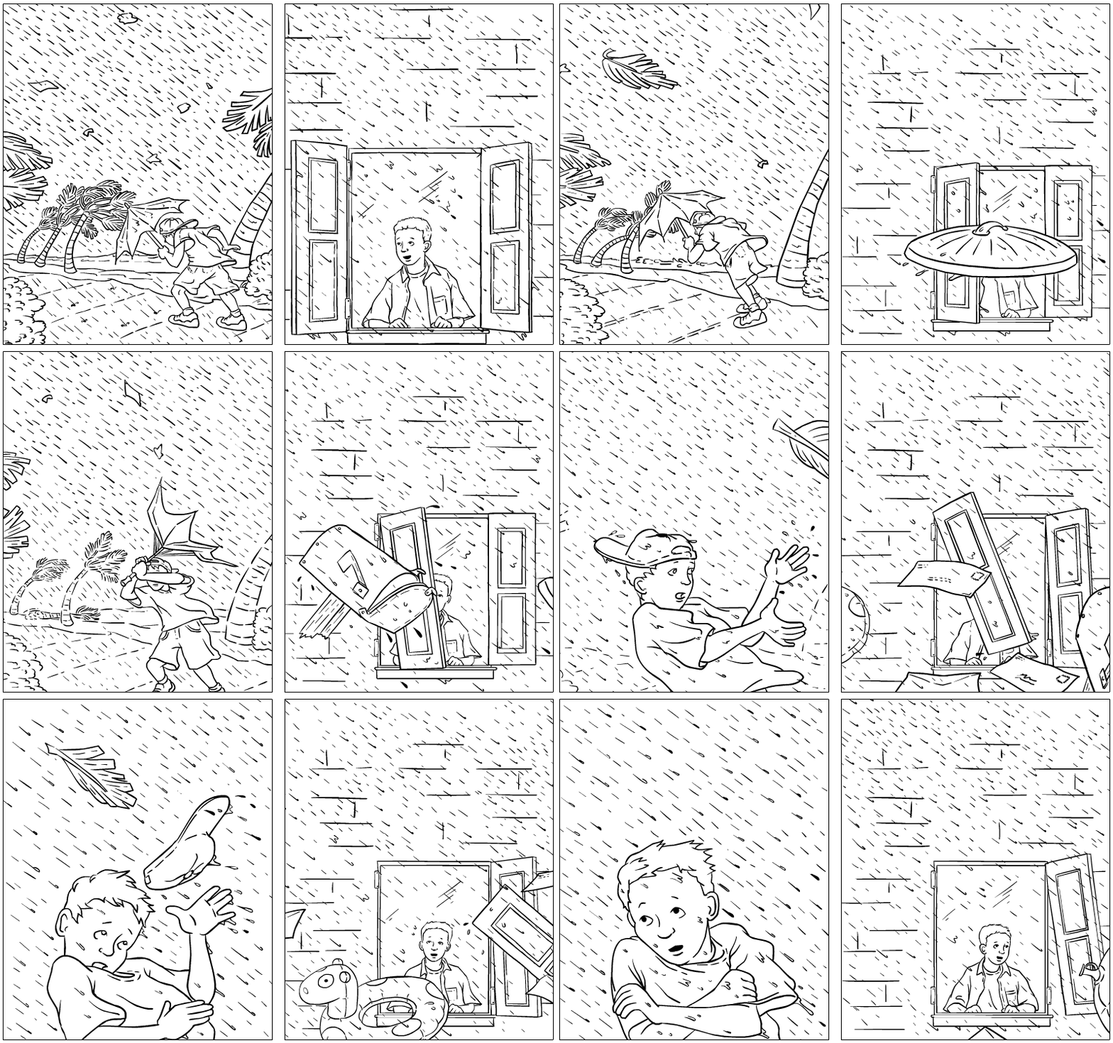
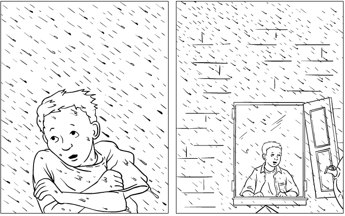
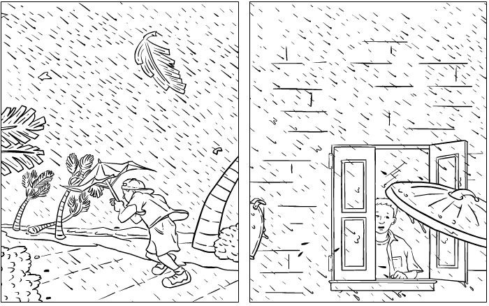
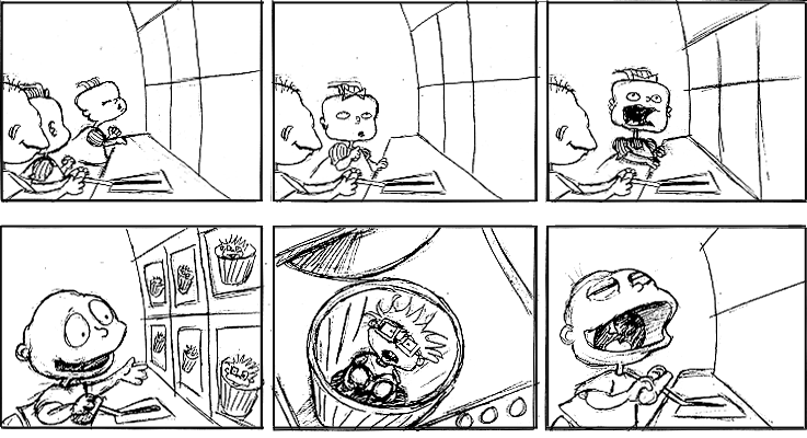
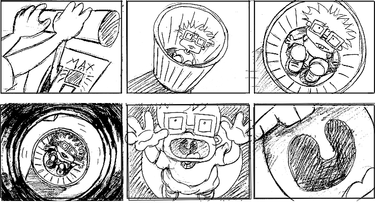
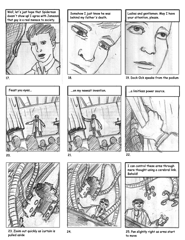
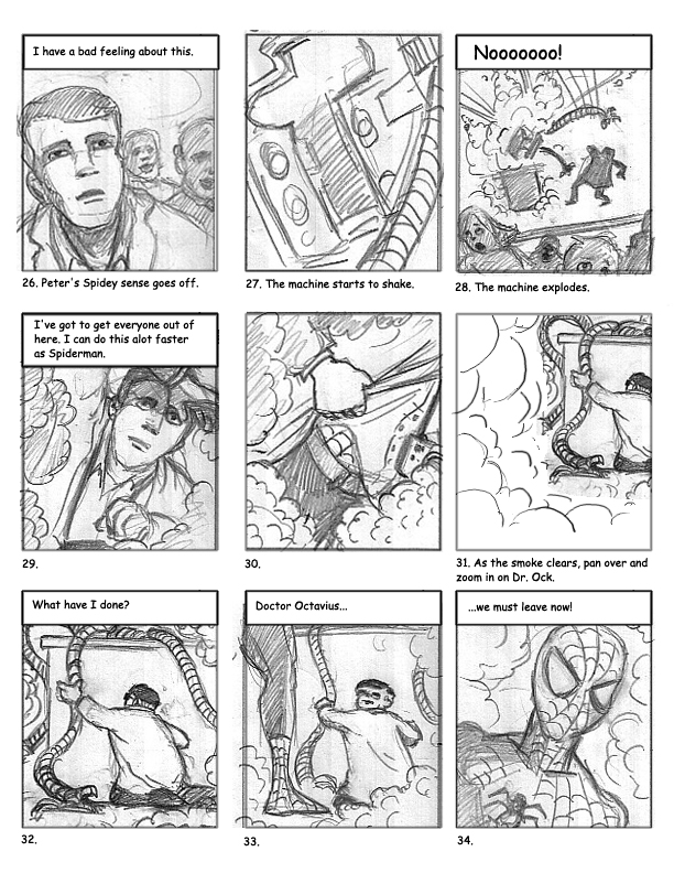
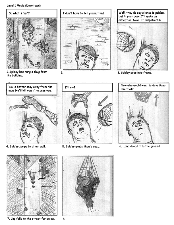
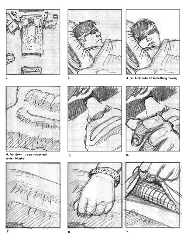
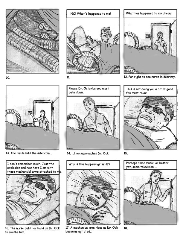
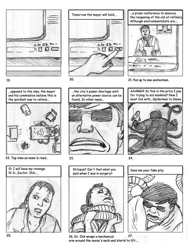
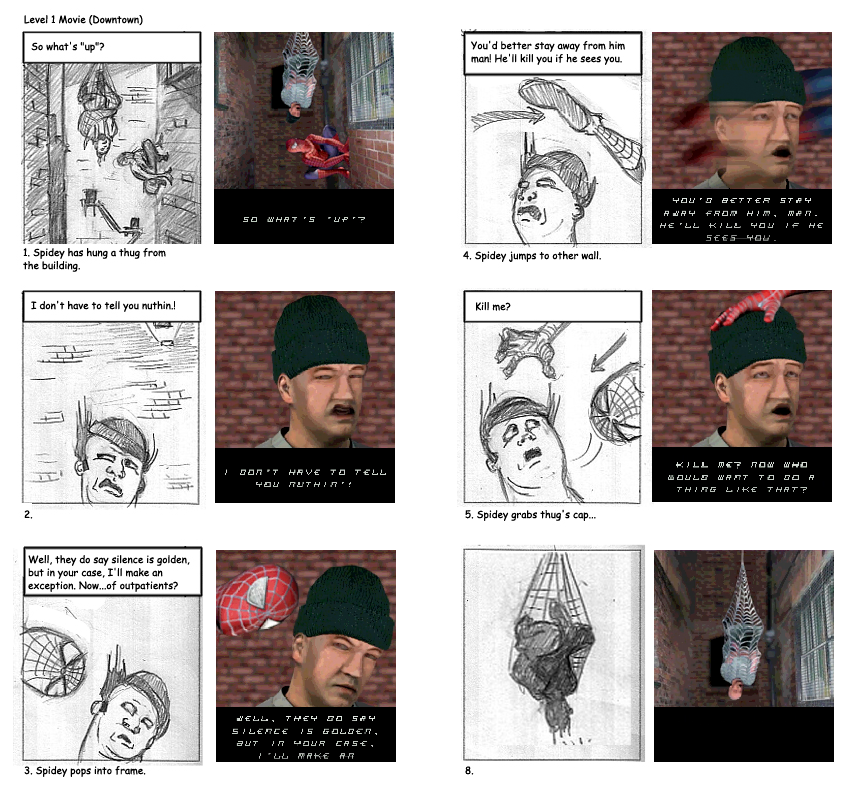
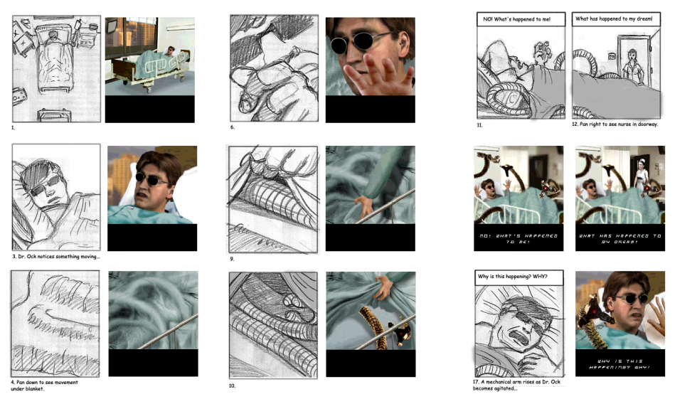
Storyboarding has been an integral part of my projects, whether for animation, games, or interactive stories. Early on, the distinction between gameplay and animated scenes (called cutscenes) was well-defined, as game engines were not yet robust enough to render the desired quality of animation in real time. Should the game experience require a more seamless feel to the transition between a rendered scene and gameplay, story design was enlisted to sort out what that would look like. The selected storyboards shown are for published games.
With the Rugrats Adventure Game for Nickelodeon and Broderbund I was involved in pre-production, animation for cutscenes, and was the lead animator on the game assets for Phil and Lil. During pre-production I storyboarded scenes that tied the story together once certain game-based tasks were completed by the player. The main challenges were to create a smooth segue between the gameplay and non-interactive scenes, blend the 2D animation with the 3D backgrounds, all the while evoking the visual style of the TV series.
The Hamtaro: Wake Up Snoozer game was based on the popular Hamtaro TV series and developed by ImaginEngine and Riverdeep/ShoPro as one of the Learning Company’s educational titles. I created storyboards, digitally painted backgrounds, and 2D animation for all of the non-interactive sequences, as well as a majority of artwork for the game layouts, and game-based character animation. As with Rugrats, the art and animation needed to follow the look and feel of the original TV series.
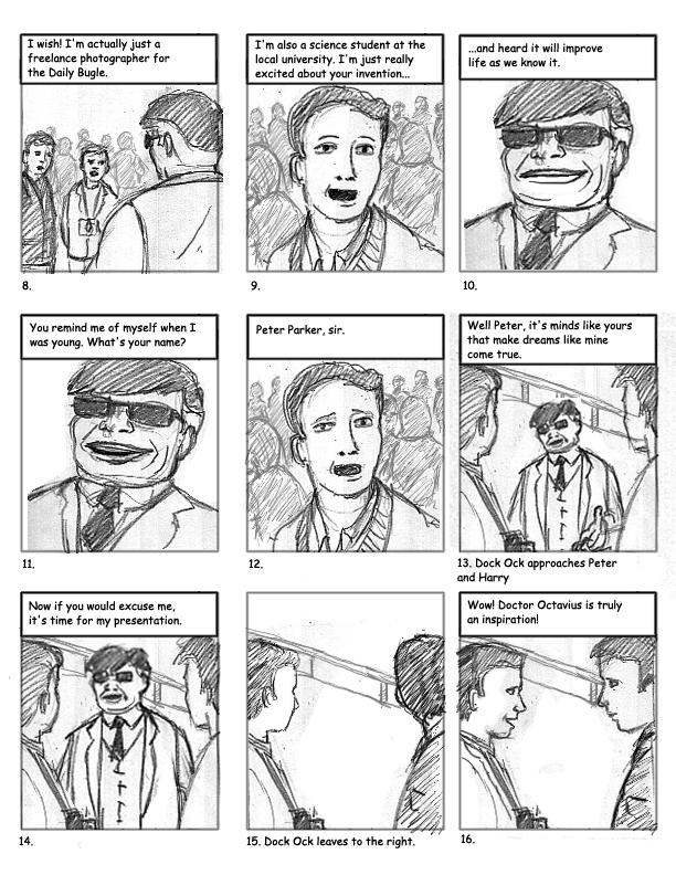
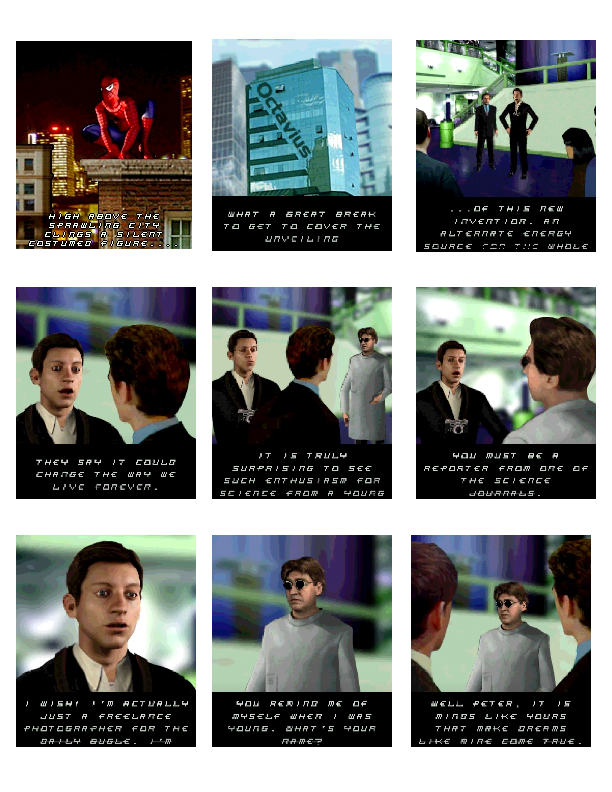
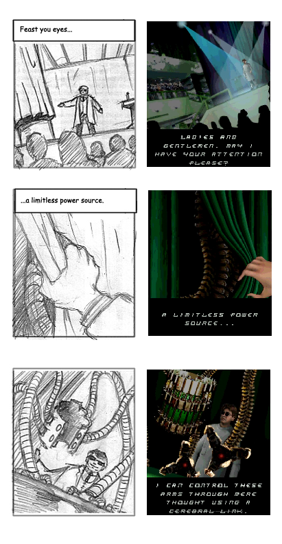
Spiderman 2 for the Nokia NGage was developed by Digital Eclipse for Activision. Originally, the storyboards I created for the game were intended to play as short 3D animations. However, the platform’s limitations required that they be adapted instead into single image panels composed of 2D and 3D artwork.
For Spiderman 2 you can see that I used the Marvel comic’s character artwork as reference for the storyboards, whereas the 3D artists that completed the work relied on likenesses of the film’s stars for the rendering of their 3D models. I’ve included a few images comparing the original storyboard panels with the final versions from the game. I note that the shift from animation to static imagery in the eventual production did dampen some of the story’s flow as it was originally envisioned.
Story Design and Storyboards
Story Design and Storyboards
Storyboarding has been an integral part of my projects, whether for animation, games, or interactive stories. Early on, the distinction between gameplay and animated scenes (called cutscenes) was well-defined, as game engines were not yet robust enough to render the desired quality of animation in real time. Should the game experience require a more seamless feel to the transition between a rendered scene and gameplay, story design was enlisted to sort out what that would look like. The selected storyboards shown are for published games.
With the Rugrats Adventure Game for Nickelodeon and Broderbund I was involved in pre-production, animation for cutscenes, and was the lead animator on the game assets for Phil and Lil. During pre-production I storyboarded scenes that tied the story together once certain game-based tasks were completed by the player. The main challenges were to create a smooth segue between the gameplay and non-interactive scenes, blend the 2D animation with the 3D backgrounds, all the while evoking the visual style of the TV series.
The Hamtaro: Wake Up Snoozer game was based on the popular Hamtaro TV series and developed by ImaginEngine and Riverdeep/ShoPro as one of the Learning Company’s educational titles. I created storyboards, digitally painted backgrounds, and 2D animation for all of the non-interactive sequences, as well as a majority of artwork for the game layouts, and game-based character animation. As with Rugrats, the art and animation needed to follow the look and feel of the original TV series.
Spiderman 2 for the Nokia NGage was developed by Digital Eclipse for Activision. Originally, the storyboards I created for the game were intended to play as short 3D animations. However, the platform’s limitations required that they be adapted instead into single image panels composed of 2D and 3D artwork.
For Spiderman 2 you can see that I used the Marvel comic’s character artwork as reference for the storyboards, whereas the 3D artists that completed the work relied on likenesses of the film’s stars for the rendering of their 3D models. I’ve included a few images comparing the original storyboard panels with the final versions from the game. I note that the shift from animation to static imagery in the eventual production did dampen some of the story’s flow as it was originally envisioned.
Rugrats
Game Character Animation, Cinematic Animation, Story Design & Storyboards
The Rugrats Adventure Game was the first computer game for the popular Nickelodeon’s Rugrats franchise, published on CD-ROM for Mac/Win. The game translated the TV-series world into an interactive environment that put the player eye to eye with the Rugrats. By combining 2D character animation with 3D-rendered sets the game maintained the TV show’s look and style while providing navigable spaces for the player.
Given the scope of the game, and the sheer amount of animation involved in the cutscenes and playable parts, the developer, Broderbund, enlisted a small army of visual artists and animators. I was involved throughout the production, first as a storyboard artist, then as an animator for a handful of cutscenes, as well as lead animator for Phil and Lil game animation as they look for and collect items in different rooms of the house.
With the production steps at the time, getting the 2D animation to work well within the 3D background was a gratifying process. I was pleased with the animation I did for Chuckie once he is successfully dumped into the train. Having designed the story sequence I was able to sit down with the 3D animators and maneuver where the camera would move to to capture the camera angles as they were storyboarded. I then worked with a stack of sequential printouts of the moving train, on which and into which I drew 2D Chuckie. You can see the sequence here at around 22:00.
Hamtaro
Art Direction, Game Layouts, Cinematic Animation, Game Character Animation, Storyboards & Story Design, Background Art
Based on the popular Hamtaro TV series, the Hamtaro: Wake Up Snoozer game was produced and developed by ImaginEngine and Riverdeep/ShoPro as one of the Learning Company’s educational titles targeted at kids ages 4-7. The game’s premise is to help the ham-hams rescue Penelope who has become lost in Boss’s freshly dug tunnels. Kids work through five different activities, each associated with separate characters and covering different educational goals such as math, language or logic, in order to find her.
For this game I created the majority of artwork for the game layouts, backgrounds and animated game assets, as well as storyboards and animation of non-interactive sequences. In order to allow our compact team of programmers and artists to generate the needed assets efficiently, I enlisted a production process that streamlined content creation.
Because of the simple shapes of the characters, and animation style of the show, we were able to work with vector graphics as opposed to hand-drawing and scanning in the art. This allowed animation that reappeared throughout the game to be animated once, and then rendered to bitmap at the relevant size depending on whether it was a cinematic sequence or part of gameplay.
PTO Agent Oso
Game Design/Game Layout Sketches
Preschool Time Online was a Disney online subscription service that helped preschoolers get a head start on their kindergarten skills through learning-based activities. Each week a new theme provided the framework for different puzzles and games that could be played with a child’s favorite Playhouse Channel characters, such as Winnie the Pooh, JoJo or Handy Manny.
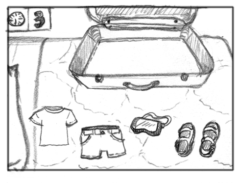
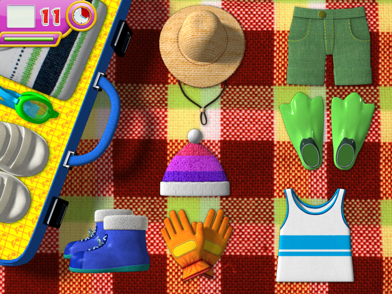
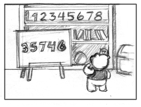
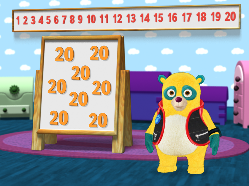
I primarily worked on the activity series that featured Special Agent Oso, providing sketches for game concepts and layouts, and preparing 3D art for final development in the 2D software being used to create the games. While guided by digital-agnostic learning outcomes, such as learning numbers, the games were also meant to familiarize children with basic computer skills, such as clicking to select, and dragging and dropping.
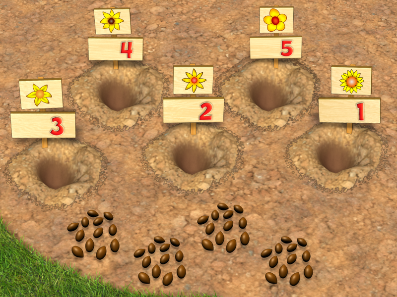
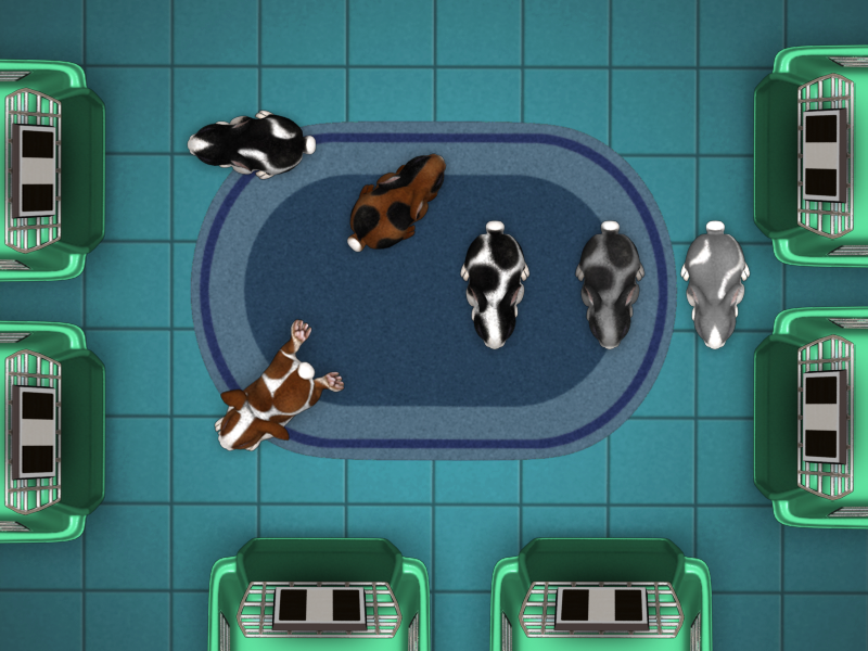
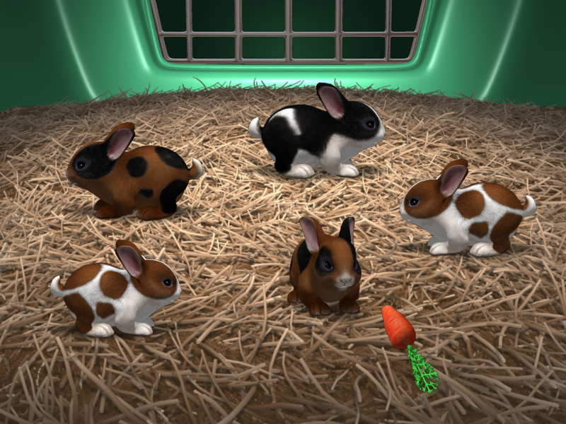
Every activity adhered to one of just a handful of mini game engines that carried out one of these simple mechanics. In this way, the very same generic action—click on something to pick it up and drag it to a target area—could be used in different story contexts, such as putting seeds into dirt, packing a suitcase, or placing photos in an album. I enjoyed adapting a kind of moving/aiming mechanic into feeding the bunnies.
2D Game Art
Art Design, Character Design, Production of Digital Assets
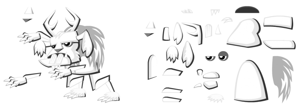
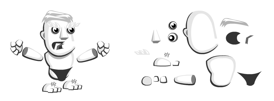
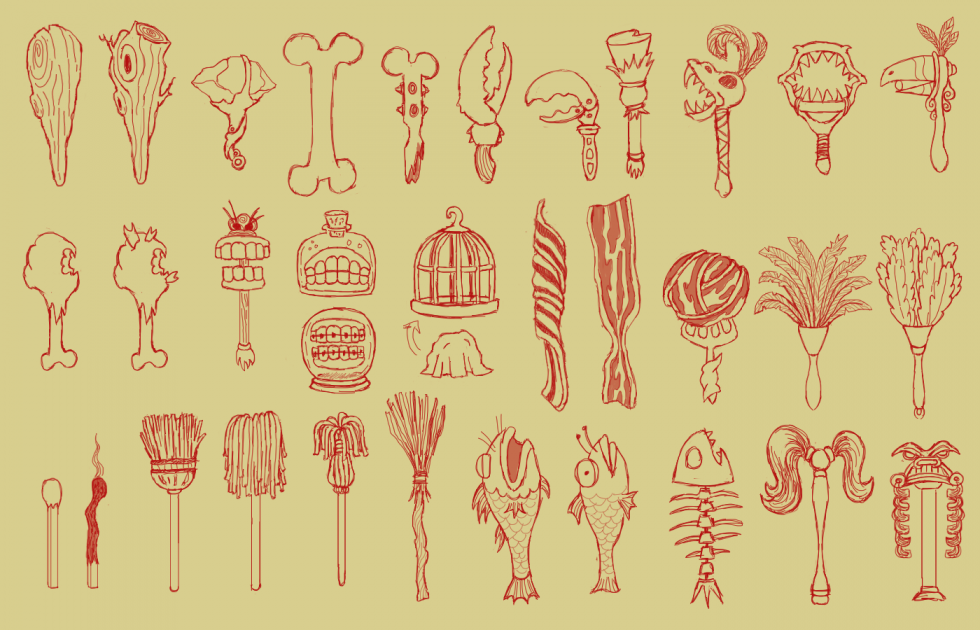
By and large, game assets used for the game world come in bits and pieces. In 2D worlds especially, working with characters is akin to manipulating a shadow puppet with articulating limbs, or emulating traditional cel animation.
Designing the pieces and how they cobble together warrants a solid understanding of how they’ll be used within the game engine and what the production pipeline looks like for getting them in there. With the Rugrats Adventure Game, the production process followed cel animation techniques. Individual body parts were composited together into full animation of the characters, and those sequences were then pulled into the game engine. For some games, this may be done computationally.
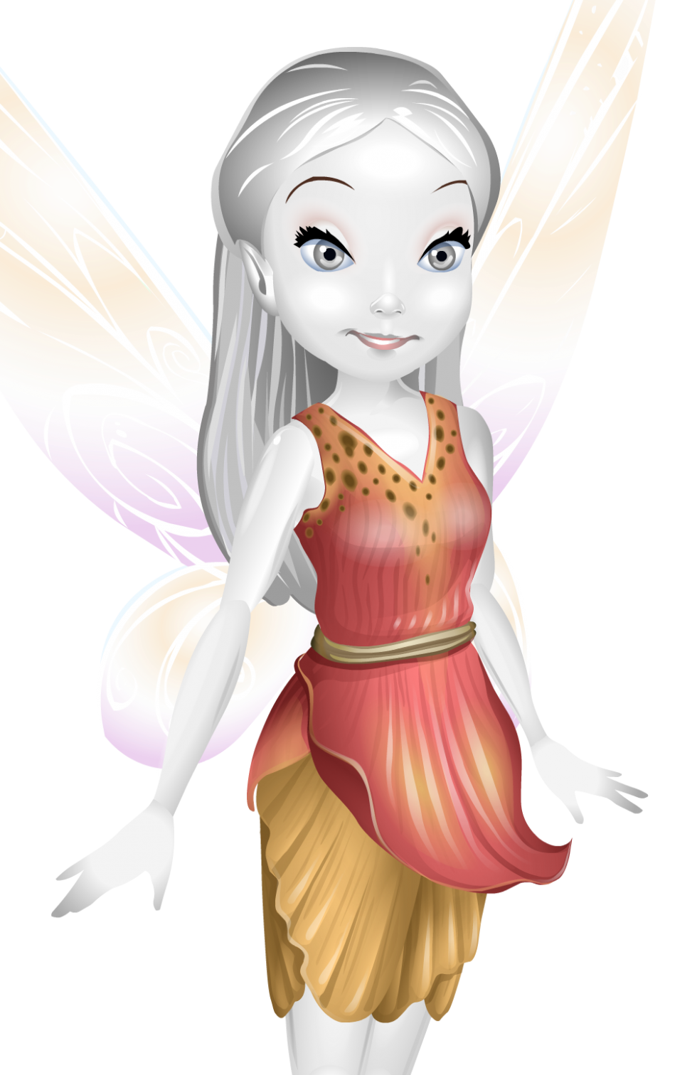
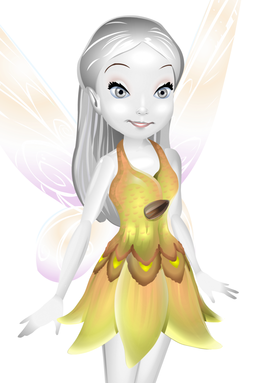
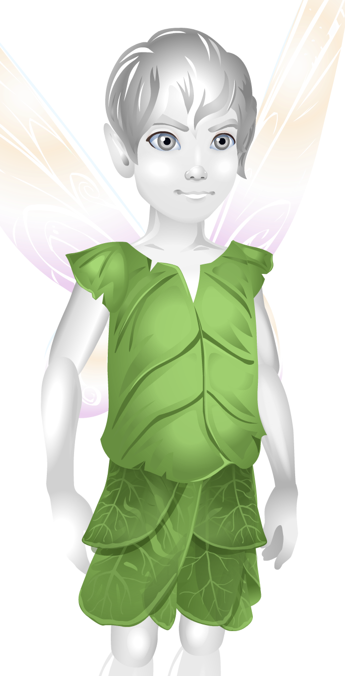
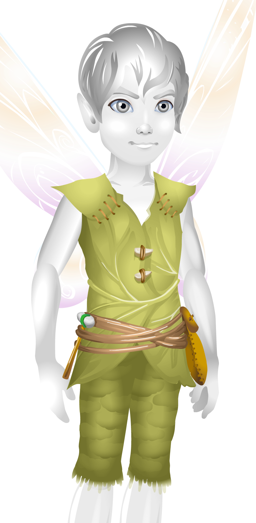
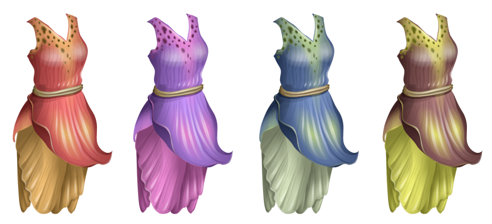
Top artwork is from Pixie Hollow, a now defunct online gaming and social environment based on the Disney Fairies franchise. Visitors created their own fairy or sparrowman and flew around to different locations in search of activities to complete and inhabitants to befriend. To extend the inventory of outfits, costumes were created in pieces, and in layers, and in grayscale, then pulled together and colored in realtime by the system. Each piece of the outfit was designed to accommodate movement of the characters’ limbs as they flew.
I was impressed with the amount of detail that could be achieved through this process—much of the art deserved to be seen at a larger scale than the teeny fairy-world size that was displayed online. I created a number of costumes and props for the world.
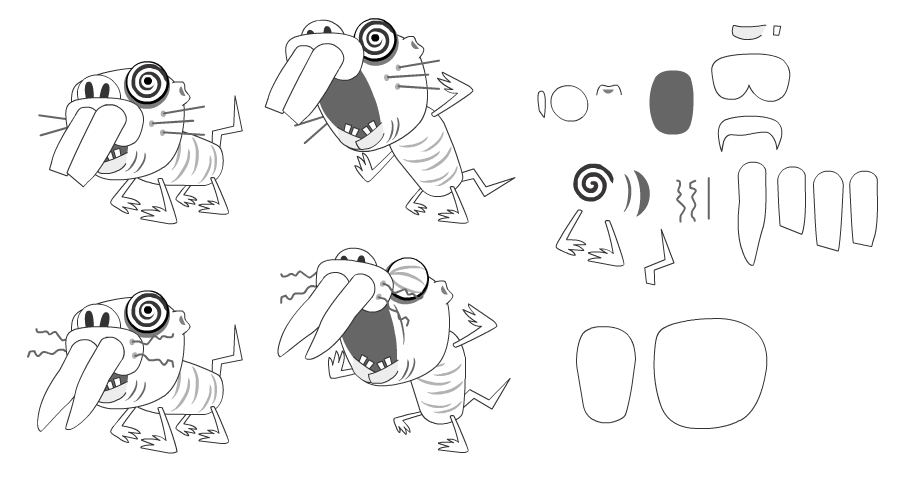
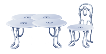
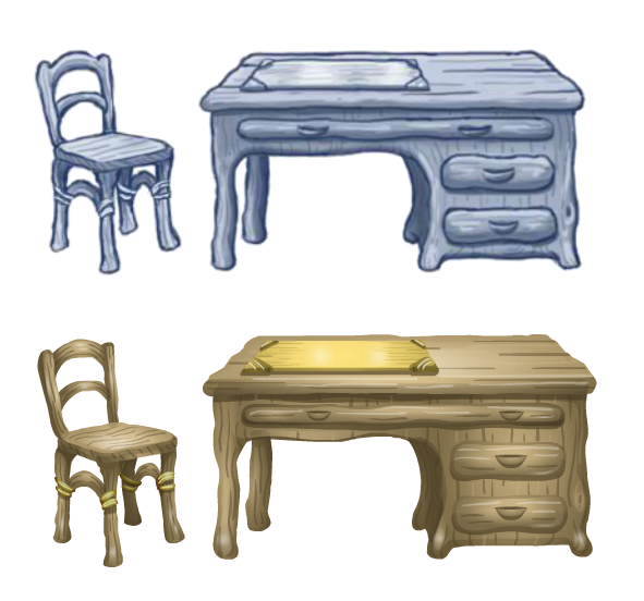
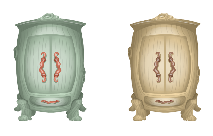
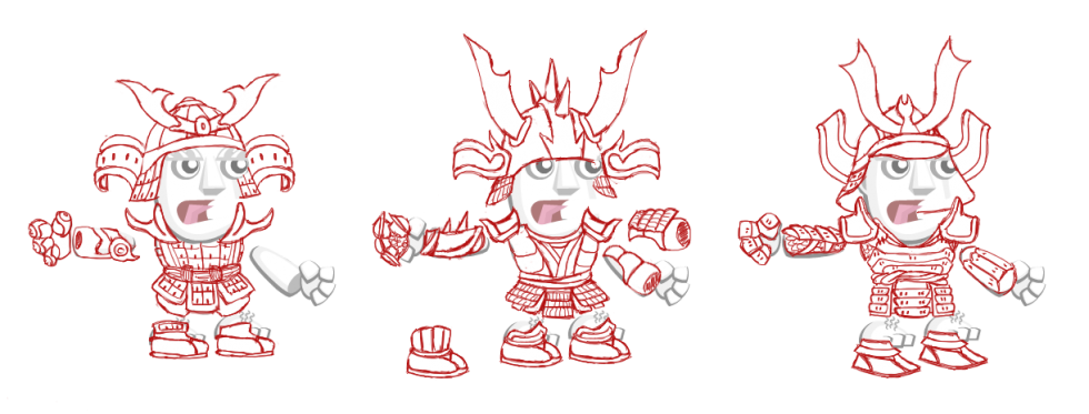
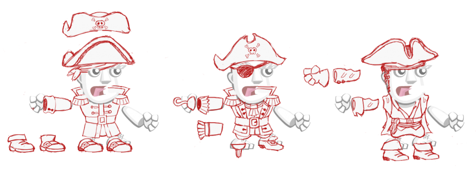
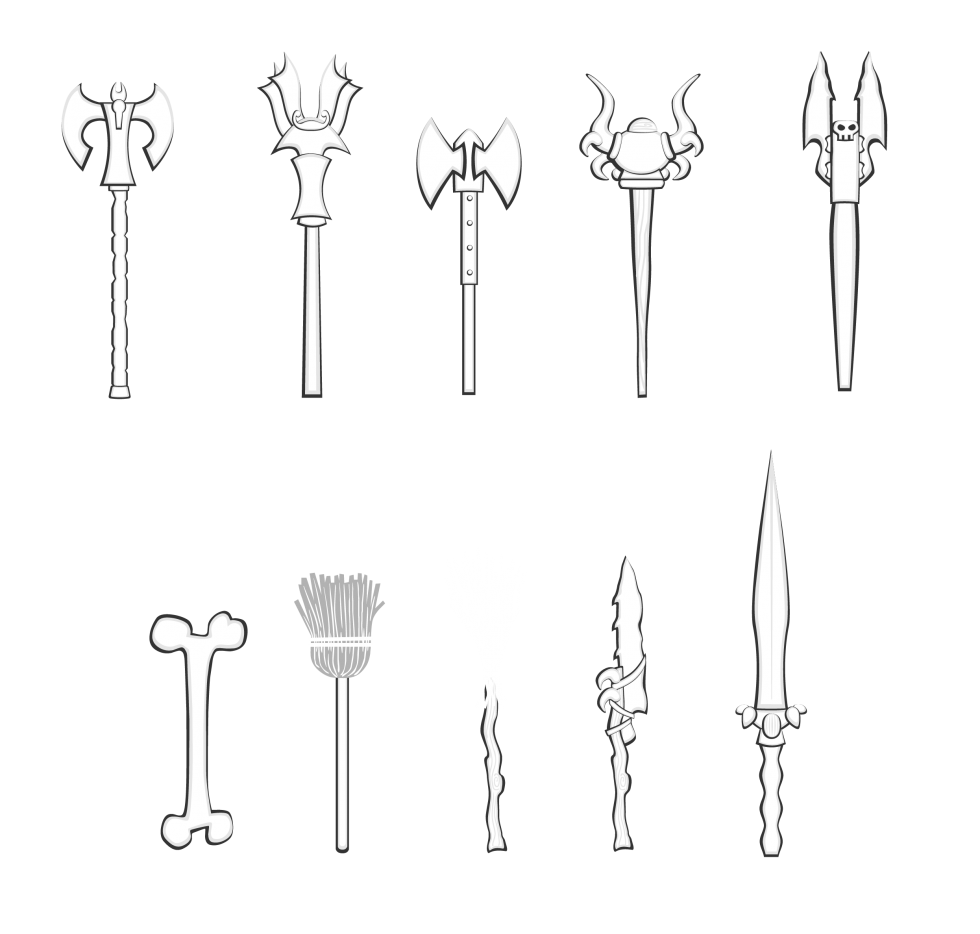
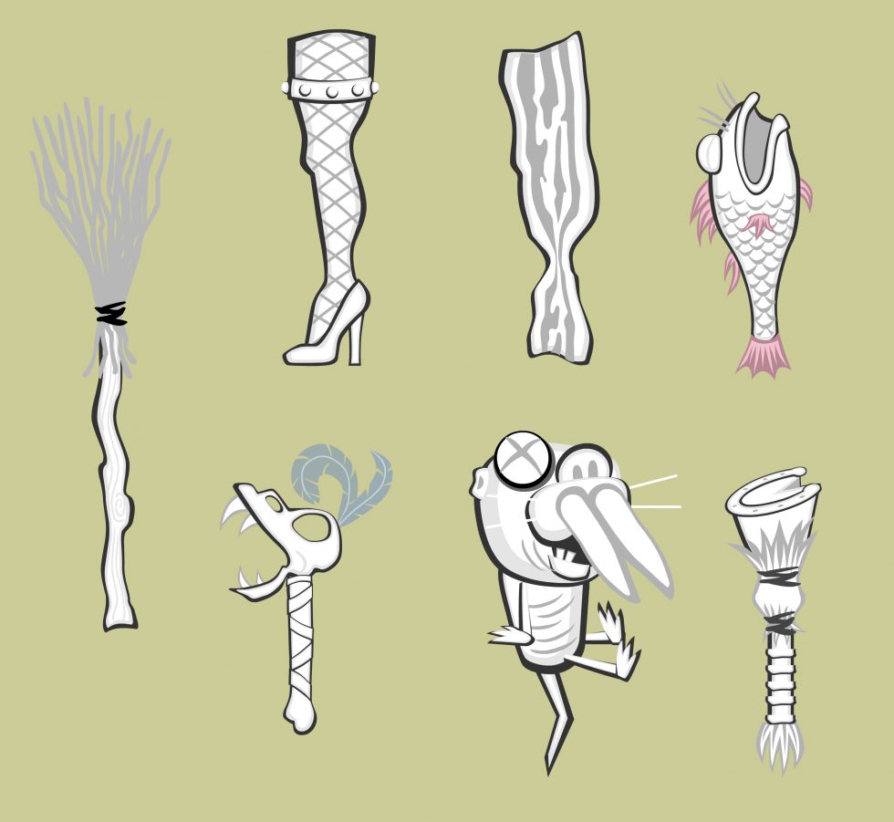
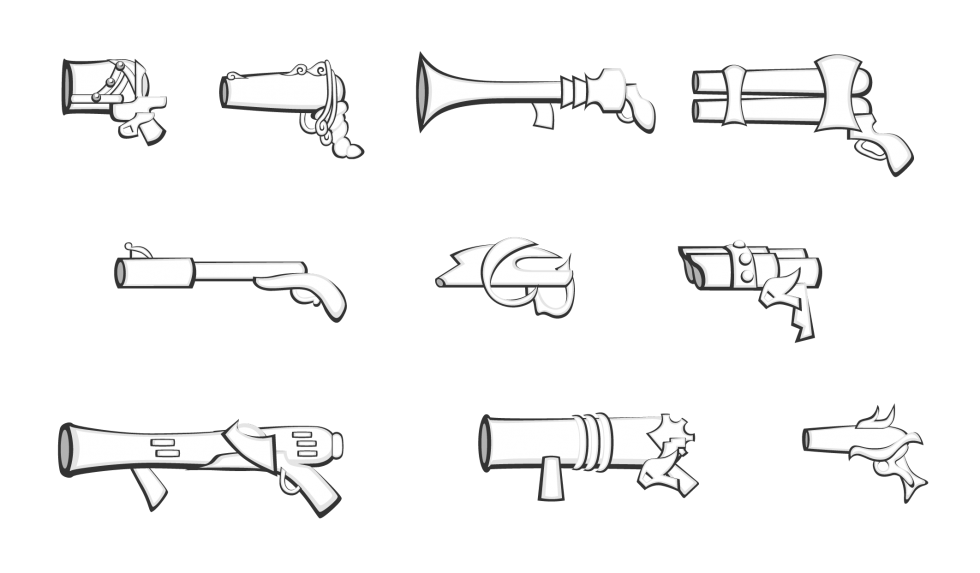
Bottom artwork is from an unpublished MMOG. The pieces were intended to be inexhaustibly mixed and matched, allowing the legs of one character to be the legs of another, or the handle of one weapon to pair with other weapony parts. In theory, any individual element within the library could be used to build a thing, in the vein of vintage-style Colorforms. Sketched concept art is shown for the character costumes that were in the works at the time.
Early Interactive Pieces
Design, Animation and Coding
for Interactive Media
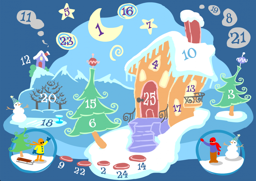
Much of my early interactive work in the mid 1990s was the chance to develop and code my own experiments and mini-games. Comfortable with various software for creating digital art and animation, the art production side was streamlined, so each of these was more an opportunity to play with the code and fiddle with sound design.
I was doing a handful of educational pieces on wildlife and their environments for Green Leap, and extended the repertory into interactive cards. I appreciated the freedom to figure out what the interaction would be and I tended towards bits that were brightly colored and playful in nature.
Monkey Face
Design and Illustration
Green Leap is an online community whose mission is “to inform and inspire individuals who share a care and concern for wildlife, nature and the environment in which we live”. The games that I created for the site focused on learning about a particular group of animals or a specific natural ecosystem.
The game “Monkey Face” had two components: a simple game of concentration and a separate section that allowed you to learn a bit of information about each of the monkeys or apes featured in the game. You can see more about the game itself in my project excerpt “Early Interactive Pieces”.
Monkey and ape illustrations shown are: Baboon, Black and White Colobus, Gibbon, Golden Snub-Nosed, Red Howler, Mandrill, Proboscis and Squirrel Monkey.
SOA Graphics
Design and Illustration
The State of the Arts Symposium, held in 2012 and organized by the Center for Conscious Creativity, was “designed to present a unique perspective on the cutting edge trends in the arts and media and their effect on education, society and culture within the context of immersive media.”
The event was held in the Vortex Dome in Los Angeles, a dome screening and performance venue owned and operated by Vortex Immersion Media in the Los Angeles Center Studios. The graphics I created for projection within the dome introduced the various speaker sessions and reflected the common threads of creativity and mindfulness in the context of immersive media and technology.
Singapore Art Museum “Be A City Planner”
Creative Direction, Production Design, Game Design and Development
In honor of Singapore’s 40th anniversary as a nation, the Singapore Art Museum created the Blink! exhibition which presented a retrospective of the physical and social changes that took place in its first forty years. “Be A City Planner” was developed as a partnership between the museum and the GameLab at Singapore’s Nanyang Technological University, where I was the lab’s director.
The installation was a hands-on exploration of the challenges facing a rapidly growing nation. On a large Singapore-shaped floor map visitors could place foam blocks of different colors, shapes and sizes. The blocks represented city structures including hospitals, schools, residential buildings and factories, each corresponding to one of the city’s basic needs. A ceiling camera fed the block layout into a nearby computer that ran a simplified urban simulation program. The program took the configuration of blocks and recreated the layout as an onscreen virtual city, complete with images of buildings that resembled actual structures in Singapore. Visitors received feedback as to whether their city configuration achieved desirable living conditions.
The museum worked closely with educators, allowing them to focus on those aspects of city planning that were relevant to their course and age group. Besides serving as director of the project, I designed and programmed the urban simulation program. Wong Chee Kien Gabriyel of NTU’s GameLab wrote the image recognition software.
Discovery Kids Flipbook
Animation
“Walk and Talk” Films
Art Direction, Storyboards, Design and Animation
These films were produced as part of the “Walk and Talk” competition sponsored by The British Council of Singapore and The National Library. Students submitted a two-minute audio walking tour of a Singapore location and the ten winning entries were turned into animated shorts. I conducted an initial storyboarding workshop with the students and over several weeks we fleshed out story direction and artwork.
When the art contribution from a team was minimal, I designed the visual story and animated the piece. Two are shown here. Based on a few key concepts that the students shared during our workshop, “Sungei Buloh” played the hustle and bustle of city life against the quiet serene of the nature preserve. In “Bugis Junction”, the students wanted to convey the spirit of their close friendship through photos they took of their favorite places to hang out together. I animated their cartoon likenesses moving from one framed photo location to another.
Art Arcade
Creative Direction, Exhibit Curator, Graphic Design
The Art Arcade was a program run by the Singapore Art Museum and hosted by the National Library Board of Singapore. The mission was to build awareness of games situated outside the commercial mainstream. It showcased a handful of independent titles and offered inspiration to budding game designers and artists.
The arcade exhibit was installed for two and half months on the children’s floor of Singapore’s largest regional library. The program included five games: “Gish” by ChronicLogic, “TeamUp” and “Rocket Bowl” both by Large Animal Games, “N” by Metanet Software, and “Space Station Sim” by Vision Videogames.
Along with curating the games showcase, I created the graphics for the library space, and worked with the library to connect aspects of each game with reading material within the library system. I worked with a local software company, Paradise Isles, to develop a game portal that ran on each of the Art Arcade computers, providing information about each title and access to playing them.
Concept Art
More often than not I produced concept art for the project in which I was involved, rendering ideas for the look and feel of any number of facets of the game or animation. I use ‘concept art’ broadly to entail art and sketches that contributed to the overall visual design, as well as drawings or thumbnails that suggested visual behavior when animation or interaction was involved.
When the teams were small for a given project, I often took on multiple aspects of the overall design—storyboarding, character design and layouts for animation, and design of the user interface.
Shown here: environments for a 3D animated lullaby as part of a music DVD, and a simple storybook with three branching storylines for a published game.
Character Design and Thumbnails
I had a professor in college who was always pointing out the bits of a drawing that held vitality. With his nose close to the paper he would curl and crimp his fingers over an imaginary pencil, as though channeling the act of that lovely little mark coming into existence.
Creating thumbnails has a similar appeal and energy, allowing not just the design of the character to emerge, but the personality as well. The bottom drawings were sketched for an interactive animated web series from Wild Brain Studios about performers with unusual stage acts. Final character designs are included. This a grouping of animation thumbnails that I particularly enjoyed working on, due to the absurdity of the show’s content.
The top three images were design ideas for two monster critters—a naked mole rat and a jackalope— for a Massively Multiplayer Online Game (MMOG) that was canceled mid-production (not an entirely uncommon situation). See the project “2D Game Art – Building Bits and Pieces” for more about translating the character designs into game assets for animation. (I was sorry not to see these critters in action.)
Story Design and Storyboards
Story Design and Storyboards
Storyboarding has been an integral part of my projects, whether for animation, games, or interactive stories. Early on, the distinction between gameplay and animated scenes (called cutscenes) was well-defined, as game engines were not yet robust enough to render the desired quality of animation in real time. Should the game experience require a more seamless feel to the transition between a rendered scene and gameplay, story design was enlisted to sort out what that would look like. The selected storyboards shown are for published games.
With the Rugrats Adventure Game for Nickelodeon and Broderbund I was involved in pre-production, animation for cutscenes, and was the lead animator on the game assets for Phil and Lil. During pre-production I storyboarded scenes that tied the story together once certain game-based tasks were completed by the player. The main challenges were to create a smooth segue between the gameplay and non-interactive scenes, blend the 2D animation with the 3D backgrounds, all the while evoking the visual style of the TV series.
The Hamtaro: Wake Up Snoozer game was based on the popular Hamtaro TV series and developed by ImaginEngine and Riverdeep/ShoPro as one of the Learning Company’s educational titles. I created storyboards, digitally painted backgrounds, and 2D animation for all of the non-interactive sequences, as well as a majority of artwork for the game layouts, and game-based character animation. As with Rugrats, the art and animation needed to follow the look and feel of the original TV series.
Spiderman 2 for the Nokia NGage was developed by Digital Eclipse for Activision. Originally, the storyboards I created for the game were intended to play as short 3D animations. However, the platform’s limitations required that they be adapted instead into single image panels composed of 2D and 3D artwork.
For Spiderman 2 you can see that I used the Marvel comic’s character artwork as reference for the storyboards, whereas the 3D artists that completed the work relied on likenesses of the film’s stars for the rendering of their 3D models. I’ve included a few images comparing the original storyboard panels with the final versions from the game. I note that the shift from animation to static imagery in the eventual production did dampen some of the story’s flow as it was originally envisioned.
Rugrats
Game Character Animation, Cinematic Animation, Story Design & Storyboards
The Rugrats Adventure Game was the first computer game for the popular Nickelodeon’s Rugrats franchise, published on CD-ROM for Mac/Win. The game translated the TV-series world into an interactive environment that put the player eye to eye with the Rugrats. By combining 2D character animation with 3D-rendered sets the game maintained the TV show’s look and style while providing navigable spaces for the player.
Given the scope of the game, and the sheer amount of animation involved in the cutscenes and playable parts, the developer, Broderbund, enlisted a small army of visual artists and animators. I was involved throughout the production, first as a storyboard artist, then as an animator for a handful of cutscenes, as well as lead animator for Phil and Lil game animation as they look for and collect items in different rooms of the house.
With the production steps at the time, getting the 2D animation to work well within the 3D background was a gratifying process. I was pleased with the animation I did for Chuckie once he is successfully dumped into the train. Having designed the story sequence I was able to sit down with the 3D animators and maneuver where the camera would move to to capture the camera angles as they were storyboarded. I then worked with a stack of sequential printouts of the moving train, on which and into which I drew 2D Chuckie. You can see the sequence here at around 22:00.
Hamtaro
Art Direction, Game Layouts, Cinematic Animation, Game Character Animation, Storyboards & Story Design, Background Art
Based on the popular Hamtaro TV series, the Hamtaro: Wake Up Snoozer game was produced and developed by ImaginEngine and Riverdeep/ShoPro as one of the Learning Company’s educational titles targeted at kids ages 4-7. The game’s premise is to help the ham-hams rescue Penelope who has become lost in Boss’s freshly dug tunnels. Kids work through five different activities, each associated with separate characters and covering different educational goals such as math, language or logic, in order to find her.
For this game I created the majority of artwork for the game layouts, backgrounds and animated game assets, as well as storyboards and animation of non-interactive sequences. In order to allow our compact team of programmers and artists to generate the needed assets efficiently, I enlisted a production process that streamlined content creation.
Because of the simple shapes of the characters, and animation style of the show, we were able to work with vector graphics as opposed to hand-drawing and scanning in the art. This allowed animation that reappeared throughout the game to be animated once, and then rendered to bitmap at the relevant size depending on whether it was a cinematic sequence or part of gameplay.
PTO Agent Oso
Game Design/Game Layout Sketches
Preschool Time Online was a Disney online subscription service that helped preschoolers get a head start on their kindergarten skills through learning-based activities. Each week a new theme provided the framework for different puzzles and games that could be played with a child’s favorite Playhouse Channel characters, such as Winnie the Pooh, JoJo or Handy Manny.
I primarily worked on the activity series that featured Special Agent Oso, providing sketches for game concepts and layouts, and preparing 3D art for final development in the 2D software being used to create the games. While guided by digital-agnostic learning outcomes, such as learning numbers, the games were also meant to familiarize children with basic computer skills, such as clicking to select, and dragging and dropping.
Every activity adhered to one of just a handful of mini game engines that carried out one of these simple mechanics. In this way, the very same generic action—click on something to pick it up and drag it to a target area—could be used in different story contexts, such as putting seeds into dirt, packing a suitcase, or placing photos in an album. I enjoyed adapting a kind of moving/aiming mechanic into feeding the bunnies.
Chutes and Ladders
Storyboards and Animation
The computer version of Chutes and Ladders for Hasbro Interactive introduced a few new aspects over the traditional board game. One of these involved a series of “Do” and “Don’t” movies that showed each time a player went up a ladder or down a chute. The movies were short lessons in social etiquette and the consequences of nice or naughty behavior towards others.
I created the storyboards for all three of the locations within the game where the vignettes took place—at the Zoo, the Park and the Circus—and worked with the writer and producer on how the positive or negative consequences played out in each scenario (many of them based on that look a parent can give—you know the one).
Unfortunately I no longer have the original storyboards, but the animations survive. The forty plus sequences that I completed were all pixel art animation.
2D Game Art
Art Design, Character Design, Production of Digital Assets
By and large, game assets used for the game world come in bits and pieces. In 2D worlds especially, working with characters is akin to manipulating a shadow puppet with articulating limbs, or emulating traditional cel animation.
Designing the pieces and how they cobble together warrants a solid understanding of how they’ll be used within the game engine and what the production pipeline looks like for getting them in there. With the Rugrats Adventure Game, the production process followed cel animation techniques. Individual body parts were composited together into full animation of the characters, and those sequences were then pulled into the game engine. For some games, this may be done computationally.
Top artwork is from Pixie Hollow, a now defunct online gaming and social environment based on the Disney Fairies franchise. Visitors created their own fairy or sparrowman and flew around to different locations in search of activities to complete and inhabitants to befriend. To extend the inventory of outfits, costumes were created in pieces, and in layers, and in grayscale, then pulled together and colored in realtime by the system. Each piece of the outfit was designed to accommodate movement of the characters’ limbs as they flew.
I was impressed with the amount of detail that could be achieved through this process—much of the art deserved to be seen at a larger scale than the teeny fairy-world size that was displayed online. I created a number of costumes and props for the world.
Bottom artwork is from an unpublished MMOG. The pieces were intended to be inexhaustibly mixed and matched, allowing the legs of one character to be the legs of another, or the handle of one weapon to pair with other weapony parts. In theory, any individual element within the library could be used to build a thing, in the vein of vintage-style Colorforms. Sketched concept art is shown for the character costumes that were in the works at the time.
Early Interactive Pieces
Design, Animation and Coding
for Interactive Media
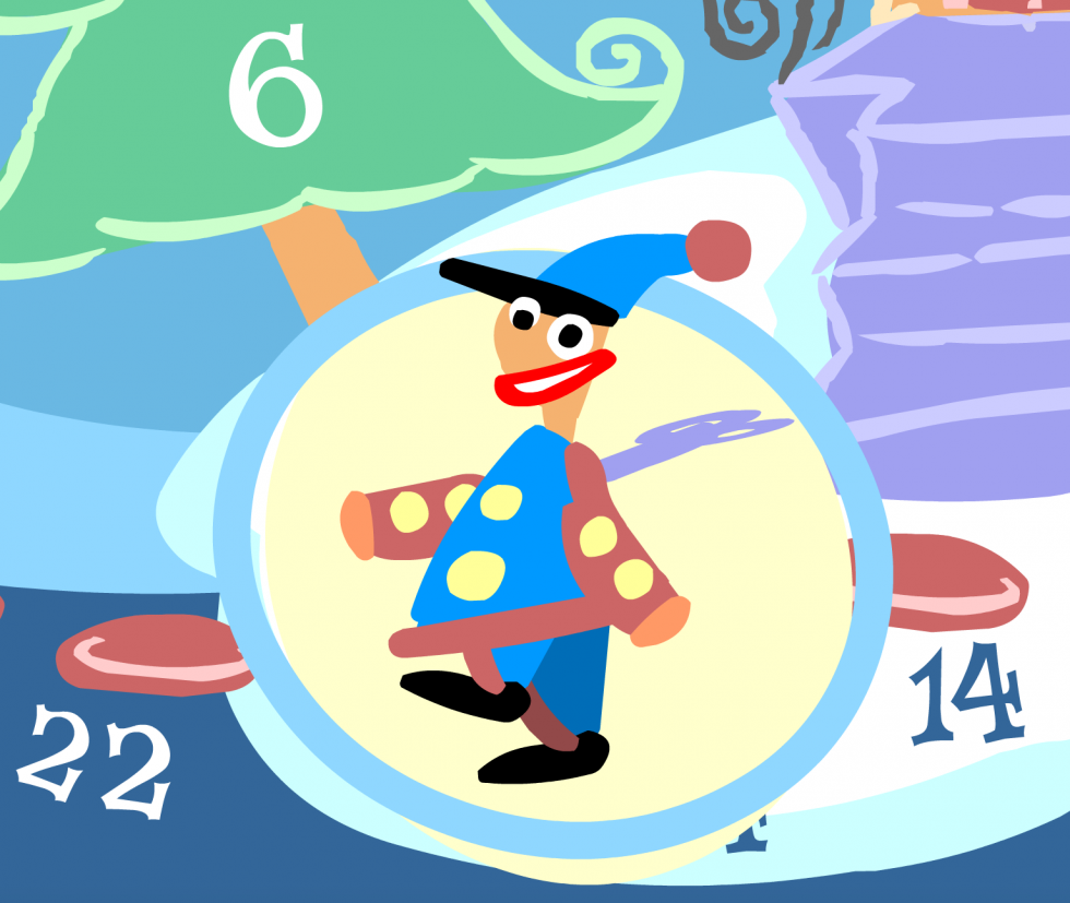
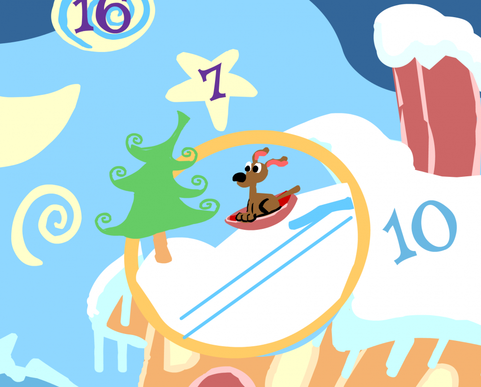
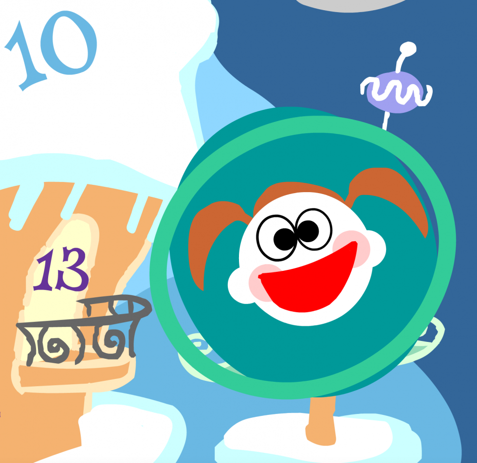
Much of my early interactive work in the mid 1990s was the chance to develop and code my own experiments and mini-games. Comfortable with various software for creating digital art and animation, the art production side was streamlined, so each of these was more an opportunity to play with the code and fiddle with sound design.
I was doing a handful of educational pieces on wildlife and their environments for Green Leap, and extended the repertory into interactive cards. I appreciated the freedom to figure out what the interaction would be and I tended towards bits that were brightly colored and playful in nature.


